跳至主要內容
HK Learn AI

網站生成實戰

MotionSites 網站提示詞庫

瀏覽完整網站設計提示詞,先看畫面或動態預覽,再把英文原文複製到 Cursor、Lovable、Claude Code 或其他編程助手。

119 個完整提示詞119 本地託管預覽35 個整理後分類
開始瀏覽

經許可重刊

每項記錄保留 MotionSites 原始編號、標題、完整英文提示詞及預覽。為方便瀏覽,來源中意思重複的分類名稱會合併顯示,原始分類仍保留在資料記錄。 40 個來源分類名稱。 提示詞與來源預覽版權屬 MotionSites,本站經許可重刊。使用生成結果前,仍應核對所用模型、素材及第三方服務的條款。

來源狀態審校日期: 2026-07-15查看 MotionSites

找到 119 個提示詞,共收錄 119 個

動態預覽只會在你選擇播放後載入。

影片資料庫編號 001

Interactive Discovery

提示詞預覽

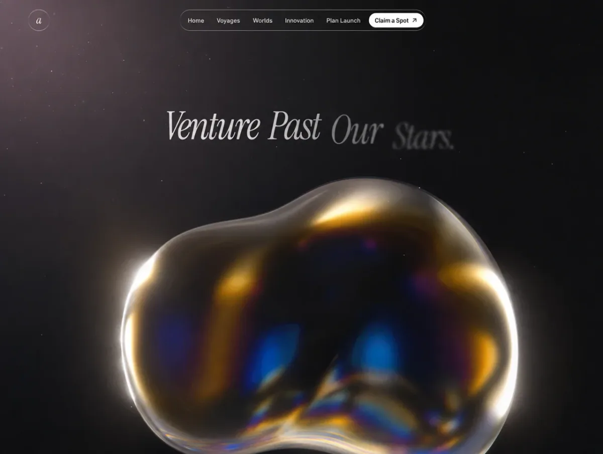
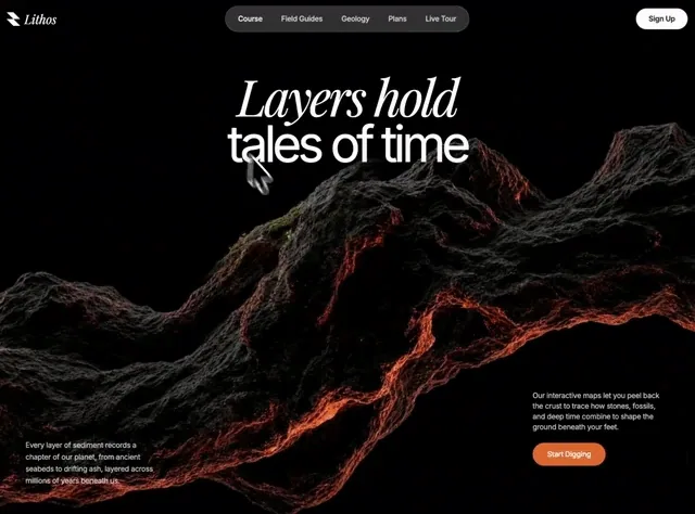
Build a full-screen, dark-themed hero section for a geology brand called **Lithos**, using **React 18 + TypeScript + Vite + Tailwind CSS** and **lucide-react** for icons. The signature feature is a **cursor-following spotlight that reveals a second image** through a soft circular mask on top of a base image. Match every detail below exactly. ### Fonts Add this to the top of `src/index.css`, then `@tailwind base/components/utilities`: ```css @import url('https://fonts.googleapis.com/css2?family=Inter:wght@300;400;500;600;700&family=Playfair+Display:ital,wght@1,400;1,500;1,600&display=swap'); * { font-family: 'Inter', sans-serif; } .font-playfair { font-family: 'Playfair Display', serif; } ``` - Body/UI font: **Inter**. - Display/wordmark accent: **Playfair Display, italic**. ### Asset URLs (use these exactly) - Base image (`BG_IMAGE_1`): `https://images.higgs.ai/?default=1&output=webp&url=https%3A%2F%2Fd8j0ntlcm91z4.cloudfront.net%2Fuser_38xzZboKViGWJOttwIXH07lWA1P%2Fhf_20260609_195923_b0ba8ace-1d1d-4f2c-9a28-1ab84b330680.png&w=1280&q=85` - Reveal image (`BG_IMAGE_2`): `https://images.higgs.ai/?default=1&output=webp&url=https%3A%2F%2Fd8j0ntlcm91z4.cloudfront.net%2Fuser_38xzZboKViGWJOttwIXH07lWA1P%2Fhf_20260609_201152_bba90a12-bf12-459f-91f0-51f237dbaf3b.png&w=1280&q=85` ### Layout & structure Root wrapper: `min-h-screen bg-white tracking-[-0.02em]`, inline `fontFamily: "'Inter', sans-serif"`. **Section** (`<section>`): `relative w-full overflow-hidden h-screen bg-black`, inline `style={{ height: '100dvh' }}`. Layers, by z-index: 1. **Base image** (`z-10`): `absolute inset-0 bg-center bg-cover bg-no-repeat`, background = `BG_IMAGE_1`. 2. **Reveal layer** (`z-30`): a `RevealLayer` component (see below) showing `BG_IMAGE_2`. 3. **Heading** (`z-50`): `absolute top-[14%] left-0 right-0 flex flex-col items-center text-center px-5 pointer-events-none`. An `<h1>` with `text-white leading-[0.95]` containing two block spans: - Line 1: `block font-playfair italic font-normal text-5xl sm:text-7xl md:text-8xl`, inline `letterSpacing: '-0.05em'`, text **"Layers hold"**. - Line 2: `block font-normal text-5xl sm:text-7xl md:text-8xl -mt-1`, inline `letterSpacing: '-0.08em'`, text **"tales of time"**. 4. **Bottom-left paragraph** (`z-50`): `hidden sm:block absolute bottom-14 left-10 md:left-14 max-w-[260px]`. `<p className="text-sm text-white/80 leading-relaxed">` — "Every layer of sediment records a chapter of our planet, from ancient seabeds to drifting ash, layered across millions of years beneath us." 5. **Bottom-right block** (`z-50`): `absolute bottom-10 sm:bottom-24 left-5 right-5 sm:left-auto sm:right-10 md:right-14 max-w-full sm:max-w-[260px] flex flex-col items-start gap-4 sm:gap-5`. Contains a `<p className="text-xs sm:text-sm text-white/80 leading-relaxed">` — "Our interactive maps let you peel back the crust to trace how stones, fossils, and deep time combine to shape the ground beneath your feet." — and a **Start Digging** button: `bg-[#e8702a] hover:bg-[#d2611f] text-white text-sm font-medium px-7 py-3 rounded-full transition-all hover:scale-[1.03] active:scale-95 hover:shadow-lg hover:shadow-[#e8702a]/30`. ### The cursor spotlight reveal (core mechanic) In the parent, define `const SPOTLIGHT_R = 260;` and track the mouse with smoothing: - Refs: `mouse` (raw), `smooth` (eased), `rafRef`; state `cursorPos` (init `{x:-999,y:-999}`). - `mousemove` listener stores raw `e.clientX/clientY`. - A `requestAnimationFrame` loop lerps: `smooth.x += (mouse.x - smooth.x) * 0.1` (same for y), then `setCursorPos`. Clean up listener + cancel RAF on unmount. `RevealLayer({ image, cursorX, cursorY })`: - Holds a hidden `<canvas>` (`absolute inset-0 pointer-events-none`, `style={{display:'none'}}`) sized to `window.innerWidth/Height` on mount + resize. - A reveal `<div>` (`absolute inset-0 bg-center bg-cover bg-no-repeat z-30 pointer-events-none`) with the reveal image as background. - On every render: clear canvas, build a **radial gradient** at `(cursorX, cursorY)` from radius 0 → `SPOTLIGHT_R` with stops: `0 → rgba(255,255,255,1)`, `0.4 → 1`, `0.6 → 0.75`, `0.75 → 0.4`, `0.88 → 0.12`, `1 → 0`. Fill an arc of radius `SPOTLIGHT_R` with it. Then `canvas.toDataURL()` and apply it as `maskImage`/`webkitMaskImage` on the reveal div with `maskSize: '100% 100%'`. This makes the second image visible only inside the soft glowing circle that trails the cursor. ### Navigation (fixed, over hero) `<nav className="fixed top-0 left-0 right-0 z-[100] flex items-center justify-between p-4 sm:p-5">`: - **Left**: an inline SVG logo (26×26, viewBox `0 0 256 256`, `fill="#ffffff"`, path `M 256 256 L 128 256 L 0 128 L 128 128 Z M 256 128 L 128 128 L 0 0 L 128 0 Z`) + wordmark `<span className="text-white text-2xl font-playfair italic">Lithos</span>`. - **Center pill** (`hidden md:flex absolute left-1/2 -translate-x-1/2 bg-white/20 backdrop-blur-md border border-white/30 rounded-full px-2 py-2 items-center gap-1`): buttons **Course** (active: full white text), then **Field Guides, Geology, Plans, Live Tour** (`text-white/80 ... hover:bg-white/20 hover:text-white transition-colors`, `px-4 py-1.5 rounded-full text-sm font-medium`). - **Right (desktop)**: `hidden md:block bg-white text-gray-900 text-sm font-semibold px-6 py-2.5 rounded-full hover:bg-gray-100` — **Sign Up**. ### Animations (premium, on load) Add to `index.css`: ```css @keyframes heroReveal { 0%{opacity:0;transform:translateY(28px);filter:blur(12px)} 100%{opacity:1;transform:translateY(0);filter:blur(0)} } @keyframes heroFadeUp { 0%{opacity:0;transform:translateY(20px)} 100%{opacity:1;transform:translateY(0)} } @keyframes heroZoom { 0%{transform:scale(1.12)} 100%{transform:scale(1)} } .hero-anim { opacity:0; animation-fill-mode:forwards; animation-timing-function:cubic-bezier(0.16,1,0.3,1); } .hero-reveal { animation-name:heroReveal; animation-duration:1.1s; } .hero-fade { animation-name:heroFadeUp; animation-duration:1s; } .hero-zoom { animation:heroZoom 1.8s cubic-bezier(0.16,1,0.3,1) forwards; } @media (prefers-reduced-motion: reduce){ .hero-anim,.hero-zoom{ animation:none; opacity:1; } } ``` Apply: - Base image div → add `hero-zoom` (slow Ken Burns zoom-out). - Heading line 1 → `hero-anim hero-reveal`, inline `animationDelay: '0.25s'`; line 2 → same with `'0.42s'` (blur-rise, staggered). - Bottom-left paragraph wrapper → `hero-anim hero-fade`, `animationDelay: '0.7s'`. - Bottom-right wrapper → `hero-anim hero-fade`, `animationDelay: '0.85s'`. ### Responsiveness - Heading scales `text-5xl` → `sm:text-7xl` → `md:text-8xl`. - Center nav pill and desktop Sign Up are `hidden` below `md`; the mobile hamburger is `md:hidden`. - Bottom-left paragraph is `hidden sm:block`; bottom-right block is full-width on mobile (`left-5 right-5`) and right-anchored from `sm`. - Use `100dvh` so mobile browser chrome doesn't clip the section.
查看完整提示詞

完整原文提示詞

Build a full-screen, dark-themed hero section for a geology brand called **Lithos**, using **React 18 + TypeScript + Vite + Tailwind CSS** and **lucide-react** for icons. The signature feature is a **cursor-following spotlight that reveals a second image** through a soft circular mask on top of a base image. Match every detail below exactly. ### Fonts Add this to the top of `src/index.css`, then `@tailwind base/components/utilities`: ```css @import url('https://fonts.googleapis.com/css2?family=Inter:wght@300;400;500;600;700&family=Playfair+Display:ital,wght@1,400;1,500;1,600&display=swap'); * { font-family: 'Inter', sans-serif; } .font-playfair { font-family: 'Playfair Display', serif; } ``` - Body/UI font: **Inter**. - Display/wordmark accent: **Playfair Display, italic**. ### Asset URLs (use these exactly) - Base image (`BG_IMAGE_1`): `https://images.higgs.ai/?default=1&output=webp&url=https%3A%2F%2Fd8j0ntlcm91z4.cloudfront.net%2Fuser_38xzZboKViGWJOttwIXH07lWA1P%2Fhf_20260609_195923_b0ba8ace-1d1d-4f2c-9a28-1ab84b330680.png&w=1280&q=85` - Reveal image (`BG_IMAGE_2`): `https://images.higgs.ai/?default=1&output=webp&url=https%3A%2F%2Fd8j0ntlcm91z4.cloudfront.net%2Fuser_38xzZboKViGWJOttwIXH07lWA1P%2Fhf_20260609_201152_bba90a12-bf12-459f-91f0-51f237dbaf3b.png&w=1280&q=85` ### Layout & structure Root wrapper: `min-h-screen bg-white tracking-[-0.02em]`, inline `fontFamily: "'Inter', sans-serif"`. **Section** (`<section>`): `relative w-full overflow-hidden h-screen bg-black`, inline `style={{ height: '100dvh' }}`. Layers, by z-index: 1. **Base image** (`z-10`): `absolute inset-0 bg-center bg-cover bg-no-repeat`, background = `BG_IMAGE_1`. 2. **Reveal layer** (`z-30`): a `RevealLayer` component (see below) showing `BG_IMAGE_2`. 3. **Heading** (`z-50`): `absolute top-[14%] left-0 right-0 flex flex-col items-center text-center px-5 pointer-events-none`. An `<h1>` with `text-white leading-[0.95]` containing two block spans: - Line 1: `block font-playfair italic font-normal text-5xl sm:text-7xl md:text-8xl`, inline `letterSpacing: '-0.05em'`, text **"Layers hold"**. - Line 2: `block font-normal text-5xl sm:text-7xl md:text-8xl -mt-1`, inline `letterSpacing: '-0.08em'`, text **"tales of time"**. 4. **Bottom-left paragraph** (`z-50`): `hidden sm:block absolute bottom-14 left-10 md:left-14 max-w-[260px]`. `<p className="text-sm text-white/80 leading-relaxed">` — "Every layer of sediment records a chapter of our planet, from ancient seabeds to drifting ash, layered across millions of years beneath us." 5. **Bottom-right block** (`z-50`): `absolute bottom-10 sm:bottom-24 left-5 right-5 sm:left-auto sm:right-10 md:right-14 max-w-full sm:max-w-[260px] flex flex-col items-start gap-4 sm:gap-5`. Contains a `<p className="text-xs sm:text-sm text-white/80 leading-relaxed">` — "Our interactive maps let you peel back the crust to trace how stones, fossils, and deep time combine to shape the ground beneath your feet." — and a **Start Digging** button: `bg-[#e8702a] hover:bg-[#d2611f] text-white text-sm font-medium px-7 py-3 rounded-full transition-all hover:scale-[1.03] active:scale-95 hover:shadow-lg hover:shadow-[#e8702a]/30`. ### The cursor spotlight reveal (core mechanic) In the parent, define `const SPOTLIGHT_R = 260;` and track the mouse with smoothing: - Refs: `mouse` (raw), `smooth` (eased), `rafRef`; state `cursorPos` (init `{x:-999,y:-999}`). - `mousemove` listener stores raw `e.clientX/clientY`. - A `requestAnimationFrame` loop lerps: `smooth.x += (mouse.x - smooth.x) * 0.1` (same for y), then `setCursorPos`. Clean up listener + cancel RAF on unmount. `RevealLayer({ image, cursorX, cursorY })`: - Holds a hidden `<canvas>` (`absolute inset-0 pointer-events-none`, `style={{display:'none'}}`) sized to `window.innerWidth/Height` on mount + resize. - A reveal `<div>` (`absolute inset-0 bg-center bg-cover bg-no-repeat z-30 pointer-events-none`) with the reveal image as background. - On every render: clear canvas, build a **radial gradient** at `(cursorX, cursorY)` from radius 0 → `SPOTLIGHT_R` with stops: `0 → rgba(255,255,255,1)`, `0.4 → 1`, `0.6 → 0.75`, `0.75 → 0.4`, `0.88 → 0.12`, `1 → 0`. Fill an arc of radius `SPOTLIGHT_R` with it. Then `canvas.toDataURL()` and apply it as `maskImage`/`webkitMaskImage` on the reveal div with `maskSize: '100% 100%'`. This makes the second image visible only inside the soft glowing circle that trails the cursor. ### Navigation (fixed, over hero) `<nav className="fixed top-0 left-0 right-0 z-[100] flex items-center justify-between p-4 sm:p-5">`: - **Left**: an inline SVG logo (26×26, viewBox `0 0 256 256`, `fill="#ffffff"`, path `M 256 256 L 128 256 L 0 128 L 128 128 Z M 256 128 L 128 128 L 0 0 L 128 0 Z`) + wordmark `<span className="text-white text-2xl font-playfair italic">Lithos</span>`. - **Center pill** (`hidden md:flex absolute left-1/2 -translate-x-1/2 bg-white/20 backdrop-blur-md border border-white/30 rounded-full px-2 py-2 items-center gap-1`): buttons **Course** (active: full white text), then **Field Guides, Geology, Plans, Live Tour** (`text-white/80 ... hover:bg-white/20 hover:text-white transition-colors`, `px-4 py-1.5 rounded-full text-sm font-medium`). - **Right (desktop)**: `hidden md:block bg-white text-gray-900 text-sm font-semibold px-6 py-2.5 rounded-full hover:bg-gray-100` — **Sign Up**. ### Animations (premium, on load) Add to `index.css`: ```css @keyframes heroReveal { 0%{opacity:0;transform:translateY(28px);filter:blur(12px)} 100%{opacity:1;transform:translateY(0);filter:blur(0)} } @keyframes heroFadeUp { 0%{opacity:0;transform:translateY(20px)} 100%{opacity:1;transform:translateY(0)} } @keyframes heroZoom { 0%{transform:scale(1.12)} 100%{transform:scale(1)} } .hero-anim { opacity:0; animation-fill-mode:forwards; animation-timing-function:cubic-bezier(0.16,1,0.3,1); } .hero-reveal { animation-name:heroReveal; animation-duration:1.1s; } .hero-fade { animation-name:heroFadeUp; animation-duration:1s; } .hero-zoom { animation:heroZoom 1.8s cubic-bezier(0.16,1,0.3,1) forwards; } @media (prefers-reduced-motion: reduce){ .hero-anim,.hero-zoom{ animation:none; opacity:1; } } ``` Apply: - Base image div → add `hero-zoom` (slow Ken Burns zoom-out). - Heading line 1 → `hero-anim hero-reveal`, inline `animationDelay: '0.25s'`; line 2 → same with `'0.42s'` (blur-rise, staggered). - Bottom-left paragraph wrapper → `hero-anim hero-fade`, `animationDelay: '0.7s'`. - Bottom-right wrapper → `hero-anim hero-fade`, `animationDelay: '0.85s'`. ### Responsiveness - Heading scales `text-5xl` → `sm:text-7xl` → `md:text-8xl`. - Center nav pill and desktop Sign Up are `hidden` below `md`; the mobile hamburger is `md:hidden`. - Bottom-left paragraph is `hidden sm:block`; bottom-right block is full-width on mobile (`left-5 right-5`) and right-anchored from `sm`. - Use `100dvh` so mobile browser chrome doesn't clip the section.
動態預覽只會在你選擇播放後載入。

影片資料庫編號 002

Bold Studio

提示詞預覽

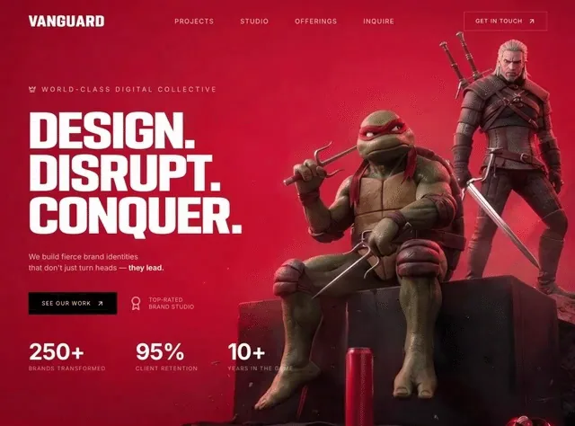
Build a fullscreen hero landing page for a creative agency called "VANGUARD" using React, Tailwind CSS, and Vite. The page should be a single viewport-height section with a looping background video and all content overlaid on top. **Background video:** Use this exact CloudFront URL as a fullscreen `<video>` element with `autoPlay`, `muted`, `loop`, and `playsInline` attributes, set to `object-cover` to fill the entire viewport: ``` https://d8j0ntlcm91z4.cloudfront.net/user_38xzZboKViGWJOttwIXH07lWA1P/hf_20260606_154941_df1a96e1-a06f-450c-bd02-d863414cc1a0.mp4 ``` **Fonts (loaded in index.html):** 1. "FSP DEMO - PODIUM Sharp 4.11" from `https://db.onlinewebfonts.com/c/8b75d9dcff6a48c35a46656192adf019?family=FSP+DEMO+-+PODIUM+Sharp+4.11` -- used for the brand name and main heading. Create a `.font-podium` utility class for it and register it in tailwind.config.js as `fontFamily.podium`. 2. "Inter" from Google Fonts (weights 400, 500, 600, 700) -- used for body text, nav links, stats, and CTAs. Register it in tailwind.config.js as `fontFamily.inter`. **Icons:** Use `lucide-react` for all icons: `ArrowUpRight`, `Award`, `Crown`, and `X`. **Navbar:** - Horizontal bar at the top with responsive padding (`px-6 sm:px-10 lg:px-16`, `py-5 lg:py-7`). - Left: brand name "VANGUARD" in `font-podium`, white, bold, uppercase, `text-2xl sm:text-3xl`, `tracking-wider`. - Center (hidden below `md`): four nav links -- "Projects", "Studio", "Offerings", "Inquire" -- in `font-inter`, `text-sm`, `text-white/80`, `tracking-widest`, uppercase, with `hover:text-white` transition. - Right (hidden below `md`): a "GET IN TOUCH" link with an `ArrowUpRight` icon, styled as a bordered button (`border border-white/30 hover:border-white/60`, `px-6 py-3`, `text-xs`, `tracking-widest`, uppercase, `hover:bg-white/10`). - Right (visible below `md`): a hamburger button made of three white `div` bars (`w-6 h-0.5`, `w-6 h-0.5`, `w-4 h-0.5` with `space-y-1.5`). **Mobile Menu Overlay (below `md` only):** - Fixed fullscreen overlay (`fixed inset-0 z-50`) with `bg-black/95 backdrop-blur-sm`. - Toggles visibility via React `useState` -- when open: `opacity-100 visible`, when closed: `opacity-0 invisible`, with `transition-all duration-500`. - Header row matches the navbar: brand name on left, `X` close icon on right. - Centered vertically: each of the 4 nav links rendered in `font-podium`, `text-4xl sm:text-5xl`, white, uppercase, with staggered entrance animations using inline `style` -- each item gets `transitionDelay: i * 80 + 100ms`, `opacity` and `translateY(20px)` transitions based on the open state. - Below the links: a "GET IN TOUCH" bordered button with the same staggered animation pattern. - All links call `setMenuOpen(false)` on click. **Hero Content (vertically centered, left-aligned):** All hero elements use staggered `animate-fade-up` animations (defined in CSS as `@keyframes fade-up` translating from `translateY(30px), opacity:0` to `translateY(0), opacity:1` over `0.8s ease-out`). Each successive element has an additional `0.2s` delay. Elements start with `opacity: 0` and use `animation-fill-mode: forwards`. 1. **Tagline:** A `Crown` icon (lucide, `w-4 h-4`, `text-white/70`) followed by "World-Class Digital Collective" in `text-white/70`, `text-xs sm:text-sm`, `font-inter`, `tracking-[0.3em]`, uppercase. Uses `animate-fade-up` (no delay). Has `mb-6 lg:mb-8`. 2. **Main Heading:** Three lines in `font-podium`, white, uppercase, `leading-[0.92]`, `tracking-tight`, each using `text-[clamp(2.8rem,8vw,7rem)]`: - "Design." - "Disrupt." - "Conquer." Uses `animate-fade-up-delay-1` (0.2s delay). 3. **Subtext:** "We build fierce brand identities" (line break) "that don't just turn heads --" then bold white "they lead." in `text-white/70`, `text-sm sm:text-base`, `font-inter`, `leading-relaxed`, `max-w-md`. Uses `animate-fade-up-delay-2` (0.4s delay). `mt-6 lg:mt-8`. 4. **CTA Row:** Uses `animate-fade-up-delay-3` (0.6s delay), `mt-8 lg:mt-10`, `flex flex-wrap items-center gap-4 sm:gap-6`. - Black button "SEE OUR WORK" with `ArrowUpRight` icon. `bg-black hover:bg-neutral-900`, `px-5 sm:px-7 py-3 sm:py-4`, `text-[11px] sm:text-xs`, `tracking-widest`, uppercase. Arrow has `group-hover:translate-x-0.5 group-hover:-translate-y-0.5` transition. - Beside it (hidden on mobile, `hidden sm:flex`): an `Award` icon (`w-8 h-8`, `text-white/50`) with two lines of text: "Top-Rated" / "Brand Studio" in `text-white/60`, `text-xs`, `tracking-wider`, uppercase. 5. **Stats Row:** Uses `animate-fade-up-delay-4` (0.8s delay), `mt-8 sm:mt-10 lg:mt-14`, `flex flex-wrap gap-6 sm:gap-12 lg:gap-16`. Three stats: - "250+" / "Brands Transformed" - "95%" / "Client Retention" - "10+" / "Years in the Game" Values in `font-inter`, white, `text-2xl sm:text-4xl lg:text-5xl`, bold, `tracking-tight`. Labels in `text-white/50`, `text-[9px] sm:text-xs`, `tracking-widest`, uppercase, `mt-1`. **CSS Animations (defined in index.css under `@layer utilities`):** ```css @keyframes fade-up { from { opacity: 0; transform: translateY(30px); } to { opacity: 1; transform: translateY(0); } } @keyframes fade-in { from { opacity: 0; } to { opacity: 1; } } @keyframes scale-in { from { opacity: 0; transform: scale(0.9); } to { opacity: 1; transform: scale(1); } } ``` With classes: `.animate-fade-up` (0s delay), `.animate-fade-up-delay-1` through `.animate-fade-up-delay-4` (0.2s increments, starting `opacity: 0`), `.animate-fade-in`, `.animate-fade-in-delay`. **Responsive behavior:** - Full layout is mobile-first with breakpoints at `sm` (640px), `md` (768px), and `lg` (1024px). - Nav links and "GET IN TOUCH" button show at `md`+; hamburger shows below `md`. - Award badge hides on mobile (`hidden sm:flex`). - All text sizes, paddings, gaps, and margins scale up through `sm:` and `lg:` prefixes. - Stats and CTA row use `flex-wrap` to prevent overflow on small screens. Make everything fully mobile responsive. Use a single `App.tsx` component with `useState` for the menu toggle. No routing needed.

查看完整提示詞

完整原文提示詞

Build a fullscreen hero landing page for a creative agency called "VANGUARD" using React, Tailwind CSS, and Vite. The page should be a single viewport-height section with a looping background video and all content overlaid on top. **Background video:** Use this exact CloudFront URL as a fullscreen `<video>` element with `autoPlay`, `muted`, `loop`, and `playsInline` attributes, set to `object-cover` to fill the entire viewport: ``` https://d8j0ntlcm91z4.cloudfront.net/user_38xzZboKViGWJOttwIXH07lWA1P/hf_20260606_154941_df1a96e1-a06f-450c-bd02-d863414cc1a0.mp4 ``` **Fonts (loaded in index.html):** 1. "FSP DEMO - PODIUM Sharp 4.11" from `https://db.onlinewebfonts.com/c/8b75d9dcff6a48c35a46656192adf019?family=FSP+DEMO+-+PODIUM+Sharp+4.11` -- used for the brand name and main heading. Create a `.font-podium` utility class for it and register it in tailwind.config.js as `fontFamily.podium`. 2. "Inter" from Google Fonts (weights 400, 500, 600, 700) -- used for body text, nav links, stats, and CTAs. Register it in tailwind.config.js as `fontFamily.inter`. **Icons:** Use `lucide-react` for all icons: `ArrowUpRight`, `Award`, `Crown`, and `X`. **Navbar:** - Horizontal bar at the top with responsive padding (`px-6 sm:px-10 lg:px-16`, `py-5 lg:py-7`). - Left: brand name "VANGUARD" in `font-podium`, white, bold, uppercase, `text-2xl sm:text-3xl`, `tracking-wider`. - Center (hidden below `md`): four nav links -- "Projects", "Studio", "Offerings", "Inquire" -- in `font-inter`, `text-sm`, `text-white/80`, `tracking-widest`, uppercase, with `hover:text-white` transition. - Right (hidden below `md`): a "GET IN TOUCH" link with an `ArrowUpRight` icon, styled as a bordered button (`border border-white/30 hover:border-white/60`, `px-6 py-3`, `text-xs`, `tracking-widest`, uppercase, `hover:bg-white/10`). - Right (visible below `md`): a hamburger button made of three white `div` bars (`w-6 h-0.5`, `w-6 h-0.5`, `w-4 h-0.5` with `space-y-1.5`). **Mobile Menu Overlay (below `md` only):** - Fixed fullscreen overlay (`fixed inset-0 z-50`) with `bg-black/95 backdrop-blur-sm`. - Toggles visibility via React `useState` -- when open: `opacity-100 visible`, when closed: `opacity-0 invisible`, with `transition-all duration-500`. - Header row matches the navbar: brand name on left, `X` close icon on right. - Centered vertically: each of the 4 nav links rendered in `font-podium`, `text-4xl sm:text-5xl`, white, uppercase, with staggered entrance animations using inline `style` -- each item gets `transitionDelay: i * 80 + 100ms`, `opacity` and `translateY(20px)` transitions based on the open state. - Below the links: a "GET IN TOUCH" bordered button with the same staggered animation pattern. - All links call `setMenuOpen(false)` on click. **Hero Content (vertically centered, left-aligned):** All hero elements use staggered `animate-fade-up` animations (defined in CSS as `@keyframes fade-up` translating from `translateY(30px), opacity:0` to `translateY(0), opacity:1` over `0.8s ease-out`). Each successive element has an additional `0.2s` delay. Elements start with `opacity: 0` and use `animation-fill-mode: forwards`. 1. **Tagline:** A `Crown` icon (lucide, `w-4 h-4`, `text-white/70`) followed by "World-Class Digital Collective" in `text-white/70`, `text-xs sm:text-sm`, `font-inter`, `tracking-[0.3em]`, uppercase. Uses `animate-fade-up` (no delay). Has `mb-6 lg:mb-8`. 2. **Main Heading:** Three lines in `font-podium`, white, uppercase, `leading-[0.92]`, `tracking-tight`, each using `text-[clamp(2.8rem,8vw,7rem)]`: - "Design." - "Disrupt." - "Conquer." Uses `animate-fade-up-delay-1` (0.2s delay). 3. **Subtext:** "We build fierce brand identities" (line break) "that don't just turn heads --" then bold white "they lead." in `text-white/70`, `text-sm sm:text-base`, `font-inter`, `leading-relaxed`, `max-w-md`. Uses `animate-fade-up-delay-2` (0.4s delay). `mt-6 lg:mt-8`. 4. **CTA Row:** Uses `animate-fade-up-delay-3` (0.6s delay), `mt-8 lg:mt-10`, `flex flex-wrap items-center gap-4 sm:gap-6`. - Black button "SEE OUR WORK" with `ArrowUpRight` icon. `bg-black hover:bg-neutral-900`, `px-5 sm:px-7 py-3 sm:py-4`, `text-[11px] sm:text-xs`, `tracking-widest`, uppercase. Arrow has `group-hover:translate-x-0.5 group-hover:-translate-y-0.5` transition. - Beside it (hidden on mobile, `hidden sm:flex`): an `Award` icon (`w-8 h-8`, `text-white/50`) with two lines of text: "Top-Rated" / "Brand Studio" in `text-white/60`, `text-xs`, `tracking-wider`, uppercase. 5. **Stats Row:** Uses `animate-fade-up-delay-4` (0.8s delay), `mt-8 sm:mt-10 lg:mt-14`, `flex flex-wrap gap-6 sm:gap-12 lg:gap-16`. Three stats: - "250+" / "Brands Transformed" - "95%" / "Client Retention" - "10+" / "Years in the Game" Values in `font-inter`, white, `text-2xl sm:text-4xl lg:text-5xl`, bold, `tracking-tight`. Labels in `text-white/50`, `text-[9px] sm:text-xs`, `tracking-widest`, uppercase, `mt-1`. **CSS Animations (defined in index.css under `@layer utilities`):** ```css @keyframes fade-up { from { opacity: 0; transform: translateY(30px); } to { opacity: 1; transform: translateY(0); } } @keyframes fade-in { from { opacity: 0; } to { opacity: 1; } } @keyframes scale-in { from { opacity: 0; transform: scale(0.9); } to { opacity: 1; transform: scale(1); } } ``` With classes: `.animate-fade-up` (0s delay), `.animate-fade-up-delay-1` through `.animate-fade-up-delay-4` (0.2s increments, starting `opacity: 0`), `.animate-fade-in`, `.animate-fade-in-delay`. **Responsive behavior:** - Full layout is mobile-first with breakpoints at `sm` (640px), `md` (768px), and `lg` (1024px). - Nav links and "GET IN TOUCH" button show at `md`+; hamburger shows below `md`. - Award badge hides on mobile (`hidden sm:flex`). - All text sizes, paddings, gaps, and margins scale up through `sm:` and `lg:` prefixes. - Stats and CTA row use `flex-wrap` to prevent overflow on small screens. Make everything fully mobile responsive. Use a single `App.tsx` component with `useState` for the menu toggle. No routing needed.

Prisma Creative Studio 預覽
圖片資料庫編號 003

Prisma Creative Studio

提示詞預覽

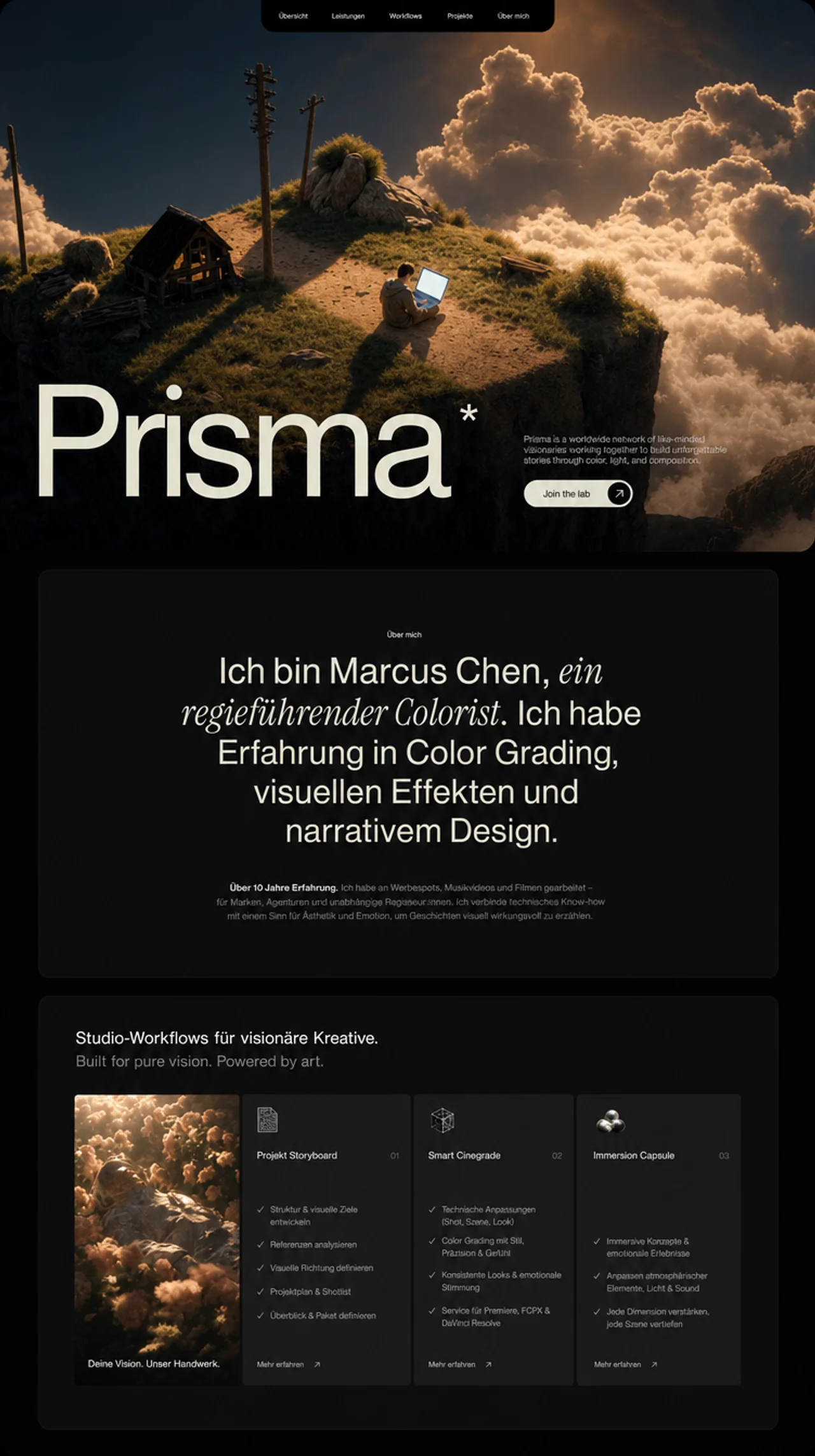
Create a React + Vite + TypeScript + Tailwind CSS landing page for a creative studio called "Prisma". The page has 3 sections: Hero, About, and Features. Use framer-motion for animations and lucide-react for icons. The design is dark, moody, and cinematic with a warm cream color palette. FONTS Load two Google Fonts in index.html: Almarai (weights: 300, 400, 700, 800) -- used as the global default font Instrument Serif (italic only) -- used for italic accent text in the About section In index.css, set the global font family: * { font-family: 'Almarai', -apple-system, BlinkMacSystemFont, 'Segoe UI', 'Roboto', 'Oxygen', 'Ubuntu', 'Cantarell', sans-serif; } In tailwind.config.js, extend: colors.primary: #DEDBC8 (warm cream, used for all primary text and accents) fontFamily.serif: ['"Instrument Serif"', 'serif'] COLOR SYSTEM Background: black (#000000) globally, #101010 for the About card, #212121 for Features cards Primary text color: #E1E0CC (applied via inline style, slightly different from Tailwind primary) Tailwind primary: #DEDBC8 (used for utility classes like text-primary, text-primary/70) Gray text: text-gray-400, text-gray-500 Navbar link color: rgba(225, 224, 204, 0.8) with hover: #E1E0CC CUSTOM CSS UTILITIES (index.css) Two SVG noise texture utilities: .noise-overlay: fractal noise (baseFrequency: 0.85, numOctaves: 3) used as overlay on hero video .bg-noise: fractal noise (baseFrequency: 0.9, numOctaves: 4) used as subtle background in Features section Both use inline SVG data URIs with feTurbulence filter. SECTION 1: HERO Full viewport height (h-screen). The entire section has p-4 md:p-6 padding creating an inset effect. Inside is a container with rounded-2xl md:rounded-[2rem] and overflow-hidden. Background video: URL: https://d8j0ntlcm91z4.cloudfront.net/user_38xzZboKViGWJOttwIXH07lWA1P/hf_20260405_170732_8a9ccda6-5cff-4628-b164-059c500a2b41.mp4 autoPlay loop muted playsInline, object-cover, fills entire container Noise overlay on top: .noise-overlay with opacity-[0.7] mix-blend-overlay pointer-events-none Gradient overlay: bg-gradient-to-b from-black/30 via-transparent to-black/60 Navbar: Absolutely positioned at top center Black background pill that hangs from top edge: bg-black rounded-b-2xl md:rounded-b-3xl px-4 py-2 md:px-8 5 nav items: "Our story", "Collective", "Workshops", "Programs", "Inquiries" Text size: text-[10px] sm:text-xs md:text-sm Gap between items: gap-3 sm:gap-6 md:gap-12 lg:gap-14 Link color: rgba(225, 224, 204, 0.8), hover: #E1E0CC (inline styles) Hero Content (bottom-aligned): Absolutely positioned at bottom: absolute bottom-0 left-0 right-0 12-column grid: left 8 columns for heading, right 4 columns for text + button Giant heading "Prisma" using WordsPullUp component: Responsive sizes: text-[26vw] sm:text-[24vw] md:text-[22vw] lg:text-[20vw] xl:text-[19vw] 2xl:text-[20vw] font-medium leading-[0.85] tracking-[-0.07em] Color: #E1E0CC Has a superscript asterisk (*) on the final "a" of "Prisma": positioned with absolute top-[0.65em] -right-[0.3em] text-[0.31em] Pull-up animation: each word slides up from y:20 with staggered delay of 0.08s, triggered by useInView Description paragraph (right column): "Prisma is a worldwide network of visual artists, filmmakers and storytellers bound not by place, status or labels but by passion and hunger to unlock potential through our unique perspectives." text-primary/70 text-xs sm:text-sm md:text-base, line-height: 1.2 Framer motion: fade up from y:20, delay 0.5s, custom ease [0.16, 1, 0.3, 1] CTA Button "Join the lab": Pill shape: bg-primary rounded-full Black text, font-medium, text-sm sm:text-base Right side has a black circle (bg-black rounded-full w-9 h-9 sm:w-10 sm:h-10) containing a white/cream ArrowRight icon Hover: gap increases (hover:gap-3), circle scales up (group-hover:scale-110) Framer motion: fade up from y:20, delay 0.7s, same custom ease SECTION 2: ABOUT bg-black, padded section with centered content Inner card: bg-[#101010], centered text, max-w-6xl Top: small label "Visual arts" in text-primary, text-[10px] sm:text-xs Main heading uses WordsPullUpMultiStyle component with 3 segments: "I am Marcus Chen," -- font-normal (Almarai) "a self-taught director." -- italic font-serif (Instrument Serif italic) "I have skills in color grading, visual effects, and narrative design." -- font-normal Container: text-3xl sm:text-4xl md:text-5xl lg:text-6xl xl:text-7xl max-w-3xl mx-auto leading-[0.95] sm:leading-[0.9] Each word animates in with pull-up effect (y:20 to y:0), staggered at 0.08s delay Body paragraph below with scroll-linked character opacity animation: Text: "Over the last seven years, I have worked with Parallax, a Berlin-based production house that crafts cinema, series, and Noir Studio in Paris. Together, we have created work that has earned international acclaim at several major festivals." text-[#DEDBC8], text-xs sm:text-sm md:text-base Each character is individually wrapped in an AnimatedLetter component Uses useScroll with target offset ['start 0.8', 'end 0.2'] Each character's opacity transitions from 0.2 to 1 based on scroll position, creating a progressive text reveal effect Character staggering: charProgress = index / totalChars, range [charProgress - 0.1, charProgress + 0.05] SECTION 3: FEATURES min-h-screen bg-black, with subtle .bg-noise overlay at opacity-[0.15] Header text uses WordsPullUpMultiStyle: Line 1: "Studio-grade workflows for visionary creators." in cream Line 2: "Built for pure vision. Powered by art." in text-gray-500 Both: text-xl sm:text-2xl md:text-3xl lg:text-4xl font-normal 4-column card grid (lg:h-[480px], gap-3 sm:gap-2 md:gap-1): Each card has staggered entrance animation: scale from 0.95 + fade in, triggered by useInView (once, margin "-100px"), staggered at 0.15s intervals with ease [0.22, 1, 0.36, 1]. Card 1 - Video card: Full video background (URL: https://d8j0ntlcm91z4.cloudfront.net/user_38xzZboKViGWJOttwIXH07lWA1P/hf_20260406_133058_0504132a-0cf3-4450-a370-8ea3b05c95d4.mp4), autoPlay loop muted playsInline, object-cover. Bottom text: "Your creative canvas." in #E1E0CC. Card 2 - "Project Storyboard." (01): bg-[#212121], small image icon at top (https://images.higgs.ai/?default=1&output=webp&url=https%3A%2F%2Fd8j0ntlcm91z4.cloudfront.net%2Fuser_38xzZboKViGWJOttwIXH07lWA1P%2Fhf_20260405_171918_4a5edc79-d78f-4637-ac8b-53c43c220606.png&w=1280&q=85, 10x10 sm:12x12 rounded), title with number, 4 checklist items with green Check icons, "Learn more" link with rotated arrow (-45deg). Card 3 - "Smart Critiques." (02): Same layout as Card 2. Icon: https://images.higgs.ai/?default=1&output=webp&url=https%3A%2F%2Fd8j0ntlcm91z4.cloudfront.net%2Fuser_38xzZboKViGWJOttwIXH07lWA1P%2Fhf_20260405_171741_ed9845ab-f5b2-4018-8ce7-07cc01823522.png&w=1280&q=85. 3 checklist items about AI analysis, creative notes, tool integrations. Card 4 - "Immersion Capsule." (03): Same layout. Icon: https://images.higgs.ai/?default=1&output=webp&url=https%3A%2F%2Fd8j0ntlcm91z4.cloudfront.net%2Fuser_38xzZboKViGWJOttwIXH07lWA1P%2Fhf_20260405_171809_f56666dc-c099-4778-ad82-9ad4f209567b.png&w=1280&q=85. 3 checklist items about notification silencing, ambient soundscapes, schedule syncing. All feature card checklist items use Check icon from lucide-react in text-primary color, with text-gray-400 description text. "Learn more" buttons use ArrowRight rotated -45deg. SHARED ANIMATION COMPONENTS WordsPullUp: Splits text by spaces, each word is a motion.span that slides up (y:20 to 0) with staggered delay. Uses useInView (once: true). Supports showAsterisk prop that adds a superscript * after the last character "a" of the final word. WordsPullUpMultiStyle: Takes an array of {text, className} segments, splits all into individual words preserving per-word className. Same pull-up animation. Words are wrapped in inline-flex flex-wrap justify-center. RESPONSIVE BREAKPOINTS The page is fully responsive across mobile, tablet, and desktop. Cards in Features switch from 1-col (mobile) to 2-col (md) to 4-col (lg). Hero text scales from 26vw down to 19vw. Navbar items compress with smaller gaps on mobile. All padding, font sizes, and spacing use Tailwind responsive prefixes (sm/md/lg/xl/2xl). TECH STACK Vite + React 18 + TypeScript Tailwind CSS 3 framer-motion (for all animations: pull-up text, fade-in, scroll-linked opacity, card entrances) lucide-react (ArrowRight, Check icons)

查看完整提示詞

完整原文提示詞

Create a React + Vite + TypeScript + Tailwind CSS landing page for a creative studio called "Prisma". The page has 3 sections: Hero, About, and Features. Use framer-motion for animations and lucide-react for icons. The design is dark, moody, and cinematic with a warm cream color palette. FONTS Load two Google Fonts in index.html: Almarai (weights: 300, 400, 700, 800) -- used as the global default font Instrument Serif (italic only) -- used for italic accent text in the About section In index.css, set the global font family: * { font-family: 'Almarai', -apple-system, BlinkMacSystemFont, 'Segoe UI', 'Roboto', 'Oxygen', 'Ubuntu', 'Cantarell', sans-serif; } In tailwind.config.js, extend: colors.primary: #DEDBC8 (warm cream, used for all primary text and accents) fontFamily.serif: ['"Instrument Serif"', 'serif'] COLOR SYSTEM Background: black (#000000) globally, #101010 for the About card, #212121 for Features cards Primary text color: #E1E0CC (applied via inline style, slightly different from Tailwind primary) Tailwind primary: #DEDBC8 (used for utility classes like text-primary, text-primary/70) Gray text: text-gray-400, text-gray-500 Navbar link color: rgba(225, 224, 204, 0.8) with hover: #E1E0CC CUSTOM CSS UTILITIES (index.css) Two SVG noise texture utilities: .noise-overlay: fractal noise (baseFrequency: 0.85, numOctaves: 3) used as overlay on hero video .bg-noise: fractal noise (baseFrequency: 0.9, numOctaves: 4) used as subtle background in Features section Both use inline SVG data URIs with feTurbulence filter. SECTION 1: HERO Full viewport height (h-screen). The entire section has p-4 md:p-6 padding creating an inset effect. Inside is a container with rounded-2xl md:rounded-[2rem] and overflow-hidden. Background video: URL: https://d8j0ntlcm91z4.cloudfront.net/user_38xzZboKViGWJOttwIXH07lWA1P/hf_20260405_170732_8a9ccda6-5cff-4628-b164-059c500a2b41.mp4 autoPlay loop muted playsInline, object-cover, fills entire container Noise overlay on top: .noise-overlay with opacity-[0.7] mix-blend-overlay pointer-events-none Gradient overlay: bg-gradient-to-b from-black/30 via-transparent to-black/60 Navbar: Absolutely positioned at top center Black background pill that hangs from top edge: bg-black rounded-b-2xl md:rounded-b-3xl px-4 py-2 md:px-8 5 nav items: "Our story", "Collective", "Workshops", "Programs", "Inquiries" Text size: text-[10px] sm:text-xs md:text-sm Gap between items: gap-3 sm:gap-6 md:gap-12 lg:gap-14 Link color: rgba(225, 224, 204, 0.8), hover: #E1E0CC (inline styles) Hero Content (bottom-aligned): Absolutely positioned at bottom: absolute bottom-0 left-0 right-0 12-column grid: left 8 columns for heading, right 4 columns for text + button Giant heading "Prisma" using WordsPullUp component: Responsive sizes: text-[26vw] sm:text-[24vw] md:text-[22vw] lg:text-[20vw] xl:text-[19vw] 2xl:text-[20vw] font-medium leading-[0.85] tracking-[-0.07em] Color: #E1E0CC Has a superscript asterisk (*) on the final "a" of "Prisma": positioned with absolute top-[0.65em] -right-[0.3em] text-[0.31em] Pull-up animation: each word slides up from y:20 with staggered delay of 0.08s, triggered by useInView Description paragraph (right column): "Prisma is a worldwide network of visual artists, filmmakers and storytellers bound not by place, status or labels but by passion and hunger to unlock potential through our unique perspectives." text-primary/70 text-xs sm:text-sm md:text-base, line-height: 1.2 Framer motion: fade up from y:20, delay 0.5s, custom ease [0.16, 1, 0.3, 1] CTA Button "Join the lab": Pill shape: bg-primary rounded-full Black text, font-medium, text-sm sm:text-base Right side has a black circle (bg-black rounded-full w-9 h-9 sm:w-10 sm:h-10) containing a white/cream ArrowRight icon Hover: gap increases (hover:gap-3), circle scales up (group-hover:scale-110) Framer motion: fade up from y:20, delay 0.7s, same custom ease SECTION 2: ABOUT bg-black, padded section with centered content Inner card: bg-[#101010], centered text, max-w-6xl Top: small label "Visual arts" in text-primary, text-[10px] sm:text-xs Main heading uses WordsPullUpMultiStyle component with 3 segments: "I am Marcus Chen," -- font-normal (Almarai) "a self-taught director." -- italic font-serif (Instrument Serif italic) "I have skills in color grading, visual effects, and narrative design." -- font-normal Container: text-3xl sm:text-4xl md:text-5xl lg:text-6xl xl:text-7xl max-w-3xl mx-auto leading-[0.95] sm:leading-[0.9] Each word animates in with pull-up effect (y:20 to y:0), staggered at 0.08s delay Body paragraph below with scroll-linked character opacity animation: Text: "Over the last seven years, I have worked with Parallax, a Berlin-based production house that crafts cinema, series, and Noir Studio in Paris. Together, we have created work that has earned international acclaim at several major festivals." text-[#DEDBC8], text-xs sm:text-sm md:text-base Each character is individually wrapped in an AnimatedLetter component Uses useScroll with target offset ['start 0.8', 'end 0.2'] Each character's opacity transitions from 0.2 to 1 based on scroll position, creating a progressive text reveal effect Character staggering: charProgress = index / totalChars, range [charProgress - 0.1, charProgress + 0.05] SECTION 3: FEATURES min-h-screen bg-black, with subtle .bg-noise overlay at opacity-[0.15] Header text uses WordsPullUpMultiStyle: Line 1: "Studio-grade workflows for visionary creators." in cream Line 2: "Built for pure vision. Powered by art." in text-gray-500 Both: text-xl sm:text-2xl md:text-3xl lg:text-4xl font-normal 4-column card grid (lg:h-[480px], gap-3 sm:gap-2 md:gap-1): Each card has staggered entrance animation: scale from 0.95 + fade in, triggered by useInView (once, margin "-100px"), staggered at 0.15s intervals with ease [0.22, 1, 0.36, 1]. Card 1 - Video card: Full video background (URL: https://d8j0ntlcm91z4.cloudfront.net/user_38xzZboKViGWJOttwIXH07lWA1P/hf_20260406_133058_0504132a-0cf3-4450-a370-8ea3b05c95d4.mp4), autoPlay loop muted playsInline, object-cover. Bottom text: "Your creative canvas." in #E1E0CC. Card 2 - "Project Storyboard." (01): bg-[#212121], small image icon at top (https://images.higgs.ai/?default=1&output=webp&url=https%3A%2F%2Fd8j0ntlcm91z4.cloudfront.net%2Fuser_38xzZboKViGWJOttwIXH07lWA1P%2Fhf_20260405_171918_4a5edc79-d78f-4637-ac8b-53c43c220606.png&w=1280&q=85, 10x10 sm:12x12 rounded), title with number, 4 checklist items with green Check icons, "Learn more" link with rotated arrow (-45deg). Card 3 - "Smart Critiques." (02): Same layout as Card 2. Icon: https://images.higgs.ai/?default=1&output=webp&url=https%3A%2F%2Fd8j0ntlcm91z4.cloudfront.net%2Fuser_38xzZboKViGWJOttwIXH07lWA1P%2Fhf_20260405_171741_ed9845ab-f5b2-4018-8ce7-07cc01823522.png&w=1280&q=85. 3 checklist items about AI analysis, creative notes, tool integrations. Card 4 - "Immersion Capsule." (03): Same layout. Icon: https://images.higgs.ai/?default=1&output=webp&url=https%3A%2F%2Fd8j0ntlcm91z4.cloudfront.net%2Fuser_38xzZboKViGWJOttwIXH07lWA1P%2Fhf_20260405_171809_f56666dc-c099-4778-ad82-9ad4f209567b.png&w=1280&q=85. 3 checklist items about notification silencing, ambient soundscapes, schedule syncing. All feature card checklist items use Check icon from lucide-react in text-primary color, with text-gray-400 description text. "Learn more" buttons use ArrowRight rotated -45deg. SHARED ANIMATION COMPONENTS WordsPullUp: Splits text by spaces, each word is a motion.span that slides up (y:20 to 0) with staggered delay. Uses useInView (once: true). Supports showAsterisk prop that adds a superscript * after the last character "a" of the final word. WordsPullUpMultiStyle: Takes an array of {text, className} segments, splits all into individual words preserving per-word className. Same pull-up animation. Words are wrapped in inline-flex flex-wrap justify-center. RESPONSIVE BREAKPOINTS The page is fully responsive across mobile, tablet, and desktop. Cards in Features switch from 1-col (mobile) to 2-col (md) to 4-col (lg). Hero text scales from 26vw down to 19vw. Navbar items compress with smaller gaps on mobile. All padding, font sizes, and spacing use Tailwind responsive prefixes (sm/md/lg/xl/2xl). TECH STACK Vite + React 18 + TypeScript Tailwind CSS 3 framer-motion (for all animations: pull-up text, fade-in, scroll-linked opacity, card entrances) lucide-react (ArrowRight, Check icons)

動態預覽只會在你選擇播放後載入。

影片資料庫編號 004

3D Jack Portfolio

提示詞預覽

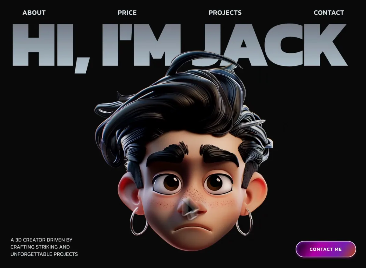
Build a 3D Creator portfolio landing page for "Jack" using React, TypeScript, Tailwind CSS, Framer Motion, and Lucide React. The page has a dark theme (#0C0C0C background) with the font Kanit (Google Fonts, weights 300-900). The page title is "Jack -- 3D Creator". GLOBAL STYLES Background: #0C0C0C on html, body, #root, and the main wrapper Font family: 'Kanit', sans-serif Global reset: box-sizing border-box, margin 0, padding 0 CSS class .hero-heading: gradient text using background: linear-gradient(180deg, #646973 0%, #BBCCD7 100%) with -webkit-background-clip: text and -webkit-text-fill-color: transparent Main wrapper has overflowX: 'clip' SECTION ORDER HeroSection MarqueeSection AboutSection ServicesSection ProjectsSection 1. HERO SECTION Full viewport height (h-screen), flex column layout with overflowX: clip. Navbar: Horizontal nav bar with 4 links -- "About", "Price", "Projects", "Contact" -- evenly spaced with justify-between. Text color #D7E2EA, font-medium, uppercase, tracking-wider. Sizes: text-sm md:text-lg lg:text-[1.4rem]. Padding: px-6 md:px-10 pt-6 md:pt-8. Hover: opacity 70% with 200ms transition. Hero Heading: Massive h1 with text "Hi, i'm jack" (lowercase "i", curly apostrophe via &apos;). Uses the .hero-heading gradient text class. Font-black, uppercase, tracking-tight, leading-none, whitespace-nowrap, w-full. Font sizes: text-[14vw] sm:text-[15vw] md:text-[16vw] lg:text-[17.5vw]. Margin top: mt-6 sm:mt-4 md:-mt-5. Wrapped in overflow-hidden container. Bottom bar: Flexbox justify-between items-end with pb-7 sm:pb-8 md:pb-10: Left: paragraph text "a 3d creator driven by crafting striking and unforgettable projects", color #D7E2EA, font-light, uppercase, tracking-wide, leading-snug. Font size: clamp(0.75rem, 1.4vw, 1.5rem). Max-width: max-w-[160px] sm:max-w-[220px] md:max-w-[260px]. Right: ContactButton component (see below) Hero Portrait: Centered absolutely. Uses a Magnet component (mouse-following magnetic effect) wrapping an image. Image URL: https://shrug-person-78902957.figma.site/_components/v2/d24c01ad3a56fc65e942a1f501eb73db42d7cf9a/Rectangle_40443.81459862.png. Magnet settings: padding 150, strength 3, activeTransition "transform 0.3s ease-out", inactiveTransition "transform 0.6s ease-in-out". Positioning: absolute left-1/2 -translate-x-1/2 z-10. Width: w-[280px] sm:w-[360px] md:w-[440px] lg:w-[520px]. On mobile: top-1/2 -translate-y-1/2. On sm+: sm:top-auto sm:translate-y-0 sm:bottom-0. FadeIn animations: Navbar fades in with delay 0, y -20. Heading: delay 0.15, y 40. Left text: delay 0.35, y 20. Contact button: delay 0.5, y 20. Portrait: delay 0.6, y 30. 2. MARQUEE SECTION Two rows of images that scroll horizontally based on page scroll position. Background #0C0C0C. Padding: pt-24 sm:pt-32 md:pt-40 pb-10. 21 GIF images from motionsites.ai (exact URLs): https://motionsites.ai/assets/hero-space-voyage-preview-eECLH3Yc.gif https://motionsites.ai/assets/hero-codenest-preview-Cgppc2qV.gif https://motionsites.ai/assets/hero-vex-ventures-preview-BczMFIiw.gif https://motionsites.ai/assets/hero-stellar-ai-v2-preview-DjvxjG3C.gif https://motionsites.ai/assets/hero-asme-preview-B_nGDnTP.gif https://motionsites.ai/assets/hero-transform-data-preview-Cx5OU29N.gif https://motionsites.ai/assets/hero-vitara-preview-Cjz2QYyU.gif https://motionsites.ai/assets/hero-terra-preview-BFjrCr7T.gif https://motionsites.ai/assets/hero-skyelite-preview-DHaZIgUv.gif https://motionsites.ai/assets/hero-aethera-preview-DknSlcTa.gif https://motionsites.ai/assets/hero-designpro-preview-D8c5_een.gif https://motionsites.ai/assets/hero-stellar-ai-preview-D3HL6bw1.gif https://motionsites.ai/assets/hero-xportfolio-preview-D4A8maiC.gif https://motionsites.ai/assets/hero-orbit-web3-preview-BXt4OttD.gif https://motionsites.ai/assets/hero-nexora-preview-cx5HmUgo.gif https://motionsites.ai/assets/hero-evr-ventures-preview-DZxeVFEX.gif https://motionsites.ai/assets/hero-planet-orbit-preview-DWAP8Z1P.gif https://motionsites.ai/assets/hero-new-era-preview-CocuDUm9.gif https://motionsites.ai/assets/hero-wealth-preview-B70idl_u.gif https://motionsites.ai/assets/hero-luminex-preview-CxOP7ce6.gif https://motionsites.ai/assets/hero-celestia-preview-0yO3jXO8.gif Row 1: first 11 images, tripled for seamless scrolling. Moves RIGHT on scroll (translateX(offset - 200)). Row 2: remaining 10 images, tripled. Moves LEFT on scroll (translateX(-(offset - 200))). Scroll offset calculated as: (window.scrollY - sectionTop + window.innerHeight) * 0.3 Each image tile: 420px x 270px, rounded-2xl, object-cover, lazy loaded. Gap between tiles: gap-3. Gap between rows: gap-3. Uses willChange: 'transform' for performance. Scroll listener is passive. 3. ABOUT SECTION Full-height centered section with min-h-screen, padding px-5 sm:px-8 md:px-10 py-20. Four decorative 3D images positioned absolutely in corners: Top-left: Moon icon -- https://shrug-person-78902957.figma.site/_components/v2/ebb2b8f25d8e24d5f0a5ca8af4c950de81aa2fd7/moon_icon.11395d36.png -- w-[120px] sm:w-[160px] md:w-[210px], positioned top-[4%] left-[1%] sm:left-[2%] md:left-[4%]. FadeIn: delay 0.1, x -80, y 0, duration 0.9. Bottom-left: 3D object -- https://shrug-person-78902957.figma.site/_components/v2/ebb2b8f25d8e24d5f0a5ca8af4c950de81aa2fd7/p59_1.4659672e.png -- w-[100px] sm:w-[140px] md:w-[180px], positioned bottom-[8%] left-[3%] sm:left-[6%] md:left-[10%]. FadeIn: delay 0.25, x -80, y 0, duration 0.9. Top-right: Lego icon -- https://shrug-person-78902957.figma.site/_components/v2/ebb2b8f25d8e24d5f0a5ca8af4c950de81aa2fd7/lego_icon-1.703bb594.png -- w-[120px] sm:w-[160px] md:w-[210px], positioned top-[4%] right-[1%] sm:right-[2%] md:right-[4%]. FadeIn: delay 0.15, x 80, y 0, duration 0.9. Bottom-right: 3D group -- https://shrug-person-78902957.figma.site/_components/v2/ebb2b8f25d8e24d5f0a5ca8af4c950de81aa2fd7/Group_134-1.2e04f3ce.png -- w-[130px] sm:w-[170px] md:w-[220px], positioned bottom-[8%] right-[3%] sm:right-[6%] md:right-[10%]. FadeIn: delay 0.3, x 80, y 0, duration 0.9. Heading: "About me" using .hero-heading gradient text, font-black, uppercase, leading-none, tracking-tight, centered. Font size: clamp(3rem, 12vw, 160px). FadeIn: delay 0, y 40. Animated paragraph: Uses a character-by-character scroll-driven opacity animation. Text: "With more than five years of experience in design, i focus on branding, web design, and user experience, i truly enjoy working with businesses that aim to stand out and present their best image. Let's build something incredible together!" -- color #D7E2EA, font-medium, centered, leading-relaxed, max-w-[560px], font size clamp(1rem, 2vw, 1.35rem). Each character animates from opacity 0.2 to 1 based on scroll progress, with scroll offset ['start 0.8', 'end 0.2']. Contact button below the text block. Gap between heading/text: gap-10 sm:gap-14 md:gap-16. Gap between text block and button: gap-16 sm:gap-20 md:gap-24. 4. SERVICES SECTION White background (#FFFFFF), with rounded-t-[40px] sm:rounded-t-[50px] md:rounded-t-[60px] top corners. Padding: px-5 sm:px-8 md:px-10 py-20 sm:py-24 md:py-32. Heading: "Services" in #0C0C0C, font-black, uppercase, centered, font size clamp(3rem, 12vw, 160px). Margin bottom: mb-16 sm:mb-20 md:mb-28. 5 service items in a vertical list, max-w-5xl, centered: 01 - 3D Modeling: "Creation of detailed objects, characters, or environments tailored to specific client needs, ideal for games, products, and visualizations." 02 - Rendering: "High-quality, photorealistic renders that showcase designs with custom lighting, textures, and materials to bring concepts to life." 03 - Motion Design: "Dynamic animations and motion graphics that add energy and storytelling to brands, products, and digital experiences." 04 - Branding: "Crafting cohesive visual identities -- from logos to full brand systems -- that communicate a clear and memorable presence." 05 - Web Design: "Designing clean, modern, and conversion-focused websites with attention to layout, typography, and user experience." Each item: horizontal layout with number (font-black, font size clamp(3rem, 10vw, 140px), color #0C0C0C) on the left and name + description stacked vertically on the right. Name: font-medium, uppercase, font size clamp(1rem, 2.2vw, 2.1rem). Description: font-light, leading-relaxed, max-w-2xl, font size clamp(0.85rem, 1.6vw, 1.25rem), opacity 0.6. Items separated by 1px borders (rgba(12, 12, 12, 0.15)). Padding: py-8 sm:py-10 md:py-12. Staggered FadeIn: each item delays by i * 0.1. 5. PROJECTS SECTION Dark background (#0C0C0C), rounded top corners rounded-t-[40px] sm:rounded-t-[50px] md:rounded-t-[60px], pulled up with -mt-10 sm:-mt-12 md:-mt-14, z-10. Heading: "Project" (singular) using .hero-heading gradient, same styling as other headings. 3 sticky-stacking project cards that scale down as you scroll past them (card stacking effect using Framer Motion useScroll and useTransform). Each card is sticky top-24 md:top-32 inside an h-[85vh] container. Scale calculation: targetScale = 1 - (totalCards - 1 - index) * 0.03. Each card offset by top: ${index * 28}px. Each card has: rounded-[40px] sm:rounded-[50px] md:rounded-[60px], border-2 border-[#D7E2EA], background #0C0C0C, padding p-4 sm:p-6 md:p-8. Card layout: Top row: Number (huge, same style as services), category label, project name, and a "Live Project" ghost button (rounded-full, border-2 #D7E2EA, uppercase, tracking-widest). Bottom row: Two-column image grid -- left column (40% width) has 2 stacked images, right column (60%) has 1 tall image. All images have heavy border radius rounded-[40px] sm:rounded-[50px] md:rounded-[60px]. Left top image height: clamp(130px, 16vw, 230px). Left bottom image height: clamp(160px, 22vw, 340px). Project data with CloudFront image URLs: Project 01 - "Nextlevel Studio" (Client): Col1 image 1: https://images.higgs.ai/?default=1&output=webp&url=https%3A%2F%2Fd8j0ntlcm91z4.cloudfront.net%2Fuser_38xzZboKViGWJOttwIXH07lWA1P%2Fhf_20260412_055344_5eff02e0-87a5-41ce-b64f-eb08da8f33db.png&w=1280&q=85 Col1 image 2: https://images.higgs.ai/?default=1&output=webp&url=https%3A%2F%2Fd8j0ntlcm91z4.cloudfront.net%2Fuser_38xzZboKViGWJOttwIXH07lWA1P%2Fhf_20260412_055431_11d841fd-8b41-46a5-82e4-b04f2407a7d8.png&w=1280&q=85 Col2 image: https://images.higgs.ai/?default=1&output=webp&url=https%3A%2F%2Fd8j0ntlcm91z4.cloudfront.net%2Fuser_38xzZboKViGWJOttwIXH07lWA1P%2Fhf_20260412_055451_e317bf2d-28d4-48cc-86b0-6f72f25b6327.png&w=1280&q=85 Project 02 - "Aura Brand Identity" (Personal): Col1 image 1: https://images.higgs.ai/?default=1&output=webp&url=https%3A%2F%2Fd8j0ntlcm91z4.cloudfront.net%2Fuser_38xzZboKViGWJOttwIXH07lWA1P%2Fhf_20260412_055654_911201c5-36d9-4bc6-bac7-331adfce159f.png&w=1280&q=85 Col1 image 2: https://images.higgs.ai/?default=1&output=webp&url=https%3A%2F%2Fd8j0ntlcm91z4.cloudfront.net%2Fuser_38xzZboKViGWJOttwIXH07lWA1P%2Fhf_20260412_055723_5ceda0b8-d9c2-4665-b2e3-83ba19ba76d1.png&w=1280&q=85 Col2 image: https://images.higgs.ai/?default=1&output=webp&url=https%3A%2F%2Fd8j0ntlcm91z4.cloudfront.net%2Fuser_38xzZboKViGWJOttwIXH07lWA1P%2Fhf_20260412_055753_adc5dcbd-a8e6-49c0-b43a-9b030d835cea.png&w=1280&q=85 Project 03 - "Solaris Digital" (Client): Col1 image 1: https://images.higgs.ai/?default=1&output=webp&url=https%3A%2F%2Fd8j0ntlcm91z4.cloudfront.net%2Fuser_38xzZboKViGWJOttwIXH07lWA1P%2Fhf_20260412_055759_963cfb0b-4bd1-4b0f-9d0a-09bd6cf95b2f.png&w=1280&q=85 Col1 image 2: https://images.higgs.ai/?default=1&output=webp&url=https%3A%2F%2Fd8j0ntlcm91z4.cloudfront.net%2Fuser_38xzZboKViGWJOttwIXH07lWA1P%2Fhf_20260412_060108_438f781a-9846-4dcc-89ab-c4e6cb830f5b.png&w=1280&q=85 Col2 image: https://images.higgs.ai/?default=1&output=webp&url=https%3A%2F%2Fd8j0ntlcm91z4.cloudfront.net%2Fuser_38xzZboKViGWJOttwIXH07lWA1P%2Fhf_20260412_055818_9d062121-ad7e-46b9-999a-1a6a692ef1ee.png&w=1280&q=85 REUSABLE COMPONENTS ContactButton: Rounded-full pill button with gradient background linear-gradient(123deg, #18011F 7%, #B600A8 37%, #7621B0 72%, #BE4C00 100%), inner box-shadow 0px 4px 4px rgba(181, 1, 167, 0.25), 4px 4px 12px #7721B1 inset, white 2px outline with -3px offset. Text: white, font-medium, uppercase, tracking-widest. Sizes: px-8 py-3 sm:px-10 sm:py-3.5 md:px-12 md:py-4, text text-xs sm:text-sm md:text-base. Label: "Contact Me". LiveProjectButton: Ghost/outline pill button. Rounded-full, border-2 border-[#D7E2EA], text color #D7E2EA, font-medium, uppercase, tracking-widest. Sizes: px-8 py-3 sm:px-10 sm:py-3.5, text text-sm sm:text-base. Hover: bg-[#D7E2EA]/10. Label: "Live Project". FadeIn: Framer Motion wrapper using whileInView with viewport={{ once: true, margin: "50px", amount: 0 }}. Accepts delay, duration (default 0.7), x (default 0), y (default 30). Easing: [0.25, 0.1, 0.25, 1]. Uses motion.create() for dynamic element types. Magnet: Mouse-following magnetic hover effect. Tracks mouse position relative to element center, applies translate3d transform divided by strength factor. Activates when cursor is within padding distance of element edge. Smooth transition in (0.3s ease-out) and out (0.6s ease-in-out). Uses willChange: 'transform'. AnimatedText: Character-by-character scroll-reveal text animation. Each character goes from opacity 0.2 to 1 based on its position in the text relative to scroll progress. Uses Framer Motion useScroll targeting the paragraph element with offset ['start 0.8', 'end 0.2']. Each character uses invisible placeholder + absolute positioned animated span. KEY DEPENDENCIES react, react-dom (^18.3.1) framer-motion (^12.38.0) lucide-react (^0.344.0) tailwindcss (^3.4.1) vite, typescript RESPONSIVE BREAKPOINTS All sections use Tailwind's default breakpoints (sm: 640px, md: 768px, lg: 1024px) with mobile-first approach. Heavy use of clamp() for fluid typography. The entire design scales gracefully from mobile to ultra-wide screens.

查看完整提示詞

完整原文提示詞

Build a 3D Creator portfolio landing page for "Jack" using React, TypeScript, Tailwind CSS, Framer Motion, and Lucide React. The page has a dark theme (#0C0C0C background) with the font Kanit (Google Fonts, weights 300-900). The page title is "Jack -- 3D Creator". GLOBAL STYLES Background: #0C0C0C on html, body, #root, and the main wrapper Font family: 'Kanit', sans-serif Global reset: box-sizing border-box, margin 0, padding 0 CSS class .hero-heading: gradient text using background: linear-gradient(180deg, #646973 0%, #BBCCD7 100%) with -webkit-background-clip: text and -webkit-text-fill-color: transparent Main wrapper has overflowX: 'clip' SECTION ORDER HeroSection MarqueeSection AboutSection ServicesSection ProjectsSection 1. HERO SECTION Full viewport height (h-screen), flex column layout with overflowX: clip. Navbar: Horizontal nav bar with 4 links -- "About", "Price", "Projects", "Contact" -- evenly spaced with justify-between. Text color #D7E2EA, font-medium, uppercase, tracking-wider. Sizes: text-sm md:text-lg lg:text-[1.4rem]. Padding: px-6 md:px-10 pt-6 md:pt-8. Hover: opacity 70% with 200ms transition. Hero Heading: Massive h1 with text "Hi, i'm jack" (lowercase "i", curly apostrophe via &apos;). Uses the .hero-heading gradient text class. Font-black, uppercase, tracking-tight, leading-none, whitespace-nowrap, w-full. Font sizes: text-[14vw] sm:text-[15vw] md:text-[16vw] lg:text-[17.5vw]. Margin top: mt-6 sm:mt-4 md:-mt-5. Wrapped in overflow-hidden container. Bottom bar: Flexbox justify-between items-end with pb-7 sm:pb-8 md:pb-10: Left: paragraph text "a 3d creator driven by crafting striking and unforgettable projects", color #D7E2EA, font-light, uppercase, tracking-wide, leading-snug. Font size: clamp(0.75rem, 1.4vw, 1.5rem). Max-width: max-w-[160px] sm:max-w-[220px] md:max-w-[260px]. Right: ContactButton component (see below) Hero Portrait: Centered absolutely. Uses a Magnet component (mouse-following magnetic effect) wrapping an image. Image URL: https://shrug-person-78902957.figma.site/_components/v2/d24c01ad3a56fc65e942a1f501eb73db42d7cf9a/Rectangle_40443.81459862.png. Magnet settings: padding 150, strength 3, activeTransition "transform 0.3s ease-out", inactiveTransition "transform 0.6s ease-in-out". Positioning: absolute left-1/2 -translate-x-1/2 z-10. Width: w-[280px] sm:w-[360px] md:w-[440px] lg:w-[520px]. On mobile: top-1/2 -translate-y-1/2. On sm+: sm:top-auto sm:translate-y-0 sm:bottom-0. FadeIn animations: Navbar fades in with delay 0, y -20. Heading: delay 0.15, y 40. Left text: delay 0.35, y 20. Contact button: delay 0.5, y 20. Portrait: delay 0.6, y 30. 2. MARQUEE SECTION Two rows of images that scroll horizontally based on page scroll position. Background #0C0C0C. Padding: pt-24 sm:pt-32 md:pt-40 pb-10. 21 GIF images from motionsites.ai (exact URLs): https://motionsites.ai/assets/hero-space-voyage-preview-eECLH3Yc.gif https://motionsites.ai/assets/hero-codenest-preview-Cgppc2qV.gif https://motionsites.ai/assets/hero-vex-ventures-preview-BczMFIiw.gif https://motionsites.ai/assets/hero-stellar-ai-v2-preview-DjvxjG3C.gif https://motionsites.ai/assets/hero-asme-preview-B_nGDnTP.gif https://motionsites.ai/assets/hero-transform-data-preview-Cx5OU29N.gif https://motionsites.ai/assets/hero-vitara-preview-Cjz2QYyU.gif https://motionsites.ai/assets/hero-terra-preview-BFjrCr7T.gif https://motionsites.ai/assets/hero-skyelite-preview-DHaZIgUv.gif https://motionsites.ai/assets/hero-aethera-preview-DknSlcTa.gif https://motionsites.ai/assets/hero-designpro-preview-D8c5_een.gif https://motionsites.ai/assets/hero-stellar-ai-preview-D3HL6bw1.gif https://motionsites.ai/assets/hero-xportfolio-preview-D4A8maiC.gif https://motionsites.ai/assets/hero-orbit-web3-preview-BXt4OttD.gif https://motionsites.ai/assets/hero-nexora-preview-cx5HmUgo.gif https://motionsites.ai/assets/hero-evr-ventures-preview-DZxeVFEX.gif https://motionsites.ai/assets/hero-planet-orbit-preview-DWAP8Z1P.gif https://motionsites.ai/assets/hero-new-era-preview-CocuDUm9.gif https://motionsites.ai/assets/hero-wealth-preview-B70idl_u.gif https://motionsites.ai/assets/hero-luminex-preview-CxOP7ce6.gif https://motionsites.ai/assets/hero-celestia-preview-0yO3jXO8.gif Row 1: first 11 images, tripled for seamless scrolling. Moves RIGHT on scroll (translateX(offset - 200)). Row 2: remaining 10 images, tripled. Moves LEFT on scroll (translateX(-(offset - 200))). Scroll offset calculated as: (window.scrollY - sectionTop + window.innerHeight) * 0.3 Each image tile: 420px x 270px, rounded-2xl, object-cover, lazy loaded. Gap between tiles: gap-3. Gap between rows: gap-3. Uses willChange: 'transform' for performance. Scroll listener is passive. 3. ABOUT SECTION Full-height centered section with min-h-screen, padding px-5 sm:px-8 md:px-10 py-20. Four decorative 3D images positioned absolutely in corners: Top-left: Moon icon -- https://shrug-person-78902957.figma.site/_components/v2/ebb2b8f25d8e24d5f0a5ca8af4c950de81aa2fd7/moon_icon.11395d36.png -- w-[120px] sm:w-[160px] md:w-[210px], positioned top-[4%] left-[1%] sm:left-[2%] md:left-[4%]. FadeIn: delay 0.1, x -80, y 0, duration 0.9. Bottom-left: 3D object -- https://shrug-person-78902957.figma.site/_components/v2/ebb2b8f25d8e24d5f0a5ca8af4c950de81aa2fd7/p59_1.4659672e.png -- w-[100px] sm:w-[140px] md:w-[180px], positioned bottom-[8%] left-[3%] sm:left-[6%] md:left-[10%]. FadeIn: delay 0.25, x -80, y 0, duration 0.9. Top-right: Lego icon -- https://shrug-person-78902957.figma.site/_components/v2/ebb2b8f25d8e24d5f0a5ca8af4c950de81aa2fd7/lego_icon-1.703bb594.png -- w-[120px] sm:w-[160px] md:w-[210px], positioned top-[4%] right-[1%] sm:right-[2%] md:right-[4%]. FadeIn: delay 0.15, x 80, y 0, duration 0.9. Bottom-right: 3D group -- https://shrug-person-78902957.figma.site/_components/v2/ebb2b8f25d8e24d5f0a5ca8af4c950de81aa2fd7/Group_134-1.2e04f3ce.png -- w-[130px] sm:w-[170px] md:w-[220px], positioned bottom-[8%] right-[3%] sm:right-[6%] md:right-[10%]. FadeIn: delay 0.3, x 80, y 0, duration 0.9. Heading: "About me" using .hero-heading gradient text, font-black, uppercase, leading-none, tracking-tight, centered. Font size: clamp(3rem, 12vw, 160px). FadeIn: delay 0, y 40. Animated paragraph: Uses a character-by-character scroll-driven opacity animation. Text: "With more than five years of experience in design, i focus on branding, web design, and user experience, i truly enjoy working with businesses that aim to stand out and present their best image. Let's build something incredible together!" -- color #D7E2EA, font-medium, centered, leading-relaxed, max-w-[560px], font size clamp(1rem, 2vw, 1.35rem). Each character animates from opacity 0.2 to 1 based on scroll progress, with scroll offset ['start 0.8', 'end 0.2']. Contact button below the text block. Gap between heading/text: gap-10 sm:gap-14 md:gap-16. Gap between text block and button: gap-16 sm:gap-20 md:gap-24. 4. SERVICES SECTION White background (#FFFFFF), with rounded-t-[40px] sm:rounded-t-[50px] md:rounded-t-[60px] top corners. Padding: px-5 sm:px-8 md:px-10 py-20 sm:py-24 md:py-32. Heading: "Services" in #0C0C0C, font-black, uppercase, centered, font size clamp(3rem, 12vw, 160px). Margin bottom: mb-16 sm:mb-20 md:mb-28. 5 service items in a vertical list, max-w-5xl, centered: 01 - 3D Modeling: "Creation of detailed objects, characters, or environments tailored to specific client needs, ideal for games, products, and visualizations." 02 - Rendering: "High-quality, photorealistic renders that showcase designs with custom lighting, textures, and materials to bring concepts to life." 03 - Motion Design: "Dynamic animations and motion graphics that add energy and storytelling to brands, products, and digital experiences." 04 - Branding: "Crafting cohesive visual identities -- from logos to full brand systems -- that communicate a clear and memorable presence." 05 - Web Design: "Designing clean, modern, and conversion-focused websites with attention to layout, typography, and user experience." Each item: horizontal layout with number (font-black, font size clamp(3rem, 10vw, 140px), color #0C0C0C) on the left and name + description stacked vertically on the right. Name: font-medium, uppercase, font size clamp(1rem, 2.2vw, 2.1rem). Description: font-light, leading-relaxed, max-w-2xl, font size clamp(0.85rem, 1.6vw, 1.25rem), opacity 0.6. Items separated by 1px borders (rgba(12, 12, 12, 0.15)). Padding: py-8 sm:py-10 md:py-12. Staggered FadeIn: each item delays by i * 0.1. 5. PROJECTS SECTION Dark background (#0C0C0C), rounded top corners rounded-t-[40px] sm:rounded-t-[50px] md:rounded-t-[60px], pulled up with -mt-10 sm:-mt-12 md:-mt-14, z-10. Heading: "Project" (singular) using .hero-heading gradient, same styling as other headings. 3 sticky-stacking project cards that scale down as you scroll past them (card stacking effect using Framer Motion useScroll and useTransform). Each card is sticky top-24 md:top-32 inside an h-[85vh] container. Scale calculation: targetScale = 1 - (totalCards - 1 - index) * 0.03. Each card offset by top: ${index * 28}px. Each card has: rounded-[40px] sm:rounded-[50px] md:rounded-[60px], border-2 border-[#D7E2EA], background #0C0C0C, padding p-4 sm:p-6 md:p-8. Card layout: Top row: Number (huge, same style as services), category label, project name, and a "Live Project" ghost button (rounded-full, border-2 #D7E2EA, uppercase, tracking-widest). Bottom row: Two-column image grid -- left column (40% width) has 2 stacked images, right column (60%) has 1 tall image. All images have heavy border radius rounded-[40px] sm:rounded-[50px] md:rounded-[60px]. Left top image height: clamp(130px, 16vw, 230px). Left bottom image height: clamp(160px, 22vw, 340px). Project data with CloudFront image URLs: Project 01 - "Nextlevel Studio" (Client): Col1 image 1: https://images.higgs.ai/?default=1&output=webp&url=https%3A%2F%2Fd8j0ntlcm91z4.cloudfront.net%2Fuser_38xzZboKViGWJOttwIXH07lWA1P%2Fhf_20260412_055344_5eff02e0-87a5-41ce-b64f-eb08da8f33db.png&w=1280&q=85 Col1 image 2: https://images.higgs.ai/?default=1&output=webp&url=https%3A%2F%2Fd8j0ntlcm91z4.cloudfront.net%2Fuser_38xzZboKViGWJOttwIXH07lWA1P%2Fhf_20260412_055431_11d841fd-8b41-46a5-82e4-b04f2407a7d8.png&w=1280&q=85 Col2 image: https://images.higgs.ai/?default=1&output=webp&url=https%3A%2F%2Fd8j0ntlcm91z4.cloudfront.net%2Fuser_38xzZboKViGWJOttwIXH07lWA1P%2Fhf_20260412_055451_e317bf2d-28d4-48cc-86b0-6f72f25b6327.png&w=1280&q=85 Project 02 - "Aura Brand Identity" (Personal): Col1 image 1: https://images.higgs.ai/?default=1&output=webp&url=https%3A%2F%2Fd8j0ntlcm91z4.cloudfront.net%2Fuser_38xzZboKViGWJOttwIXH07lWA1P%2Fhf_20260412_055654_911201c5-36d9-4bc6-bac7-331adfce159f.png&w=1280&q=85 Col1 image 2: https://images.higgs.ai/?default=1&output=webp&url=https%3A%2F%2Fd8j0ntlcm91z4.cloudfront.net%2Fuser_38xzZboKViGWJOttwIXH07lWA1P%2Fhf_20260412_055723_5ceda0b8-d9c2-4665-b2e3-83ba19ba76d1.png&w=1280&q=85 Col2 image: https://images.higgs.ai/?default=1&output=webp&url=https%3A%2F%2Fd8j0ntlcm91z4.cloudfront.net%2Fuser_38xzZboKViGWJOttwIXH07lWA1P%2Fhf_20260412_055753_adc5dcbd-a8e6-49c0-b43a-9b030d835cea.png&w=1280&q=85 Project 03 - "Solaris Digital" (Client): Col1 image 1: https://images.higgs.ai/?default=1&output=webp&url=https%3A%2F%2Fd8j0ntlcm91z4.cloudfront.net%2Fuser_38xzZboKViGWJOttwIXH07lWA1P%2Fhf_20260412_055759_963cfb0b-4bd1-4b0f-9d0a-09bd6cf95b2f.png&w=1280&q=85 Col1 image 2: https://images.higgs.ai/?default=1&output=webp&url=https%3A%2F%2Fd8j0ntlcm91z4.cloudfront.net%2Fuser_38xzZboKViGWJOttwIXH07lWA1P%2Fhf_20260412_060108_438f781a-9846-4dcc-89ab-c4e6cb830f5b.png&w=1280&q=85 Col2 image: https://images.higgs.ai/?default=1&output=webp&url=https%3A%2F%2Fd8j0ntlcm91z4.cloudfront.net%2Fuser_38xzZboKViGWJOttwIXH07lWA1P%2Fhf_20260412_055818_9d062121-ad7e-46b9-999a-1a6a692ef1ee.png&w=1280&q=85 REUSABLE COMPONENTS ContactButton: Rounded-full pill button with gradient background linear-gradient(123deg, #18011F 7%, #B600A8 37%, #7621B0 72%, #BE4C00 100%), inner box-shadow 0px 4px 4px rgba(181, 1, 167, 0.25), 4px 4px 12px #7721B1 inset, white 2px outline with -3px offset. Text: white, font-medium, uppercase, tracking-widest. Sizes: px-8 py-3 sm:px-10 sm:py-3.5 md:px-12 md:py-4, text text-xs sm:text-sm md:text-base. Label: "Contact Me". LiveProjectButton: Ghost/outline pill button. Rounded-full, border-2 border-[#D7E2EA], text color #D7E2EA, font-medium, uppercase, tracking-widest. Sizes: px-8 py-3 sm:px-10 sm:py-3.5, text text-sm sm:text-base. Hover: bg-[#D7E2EA]/10. Label: "Live Project". FadeIn: Framer Motion wrapper using whileInView with viewport={{ once: true, margin: "50px", amount: 0 }}. Accepts delay, duration (default 0.7), x (default 0), y (default 30). Easing: [0.25, 0.1, 0.25, 1]. Uses motion.create() for dynamic element types. Magnet: Mouse-following magnetic hover effect. Tracks mouse position relative to element center, applies translate3d transform divided by strength factor. Activates when cursor is within padding distance of element edge. Smooth transition in (0.3s ease-out) and out (0.6s ease-in-out). Uses willChange: 'transform'. AnimatedText: Character-by-character scroll-reveal text animation. Each character goes from opacity 0.2 to 1 based on its position in the text relative to scroll progress. Uses Framer Motion useScroll targeting the paragraph element with offset ['start 0.8', 'end 0.2']. Each character uses invisible placeholder + absolute positioned animated span. KEY DEPENDENCIES react, react-dom (^18.3.1) framer-motion (^12.38.0) lucide-react (^0.344.0) tailwindcss (^3.4.1) vite, typescript RESPONSIVE BREAKPOINTS All sections use Tailwind's default breakpoints (sm: 640px, md: 768px, lg: 1024px) with mobile-first approach. Heavy use of clamp() for fluid typography. The entire design scales gracefully from mobile to ultra-wide screens.

動態預覽只會在你選擇播放後載入。

影片資料庫編號 005

Velorah

提示詞預覽

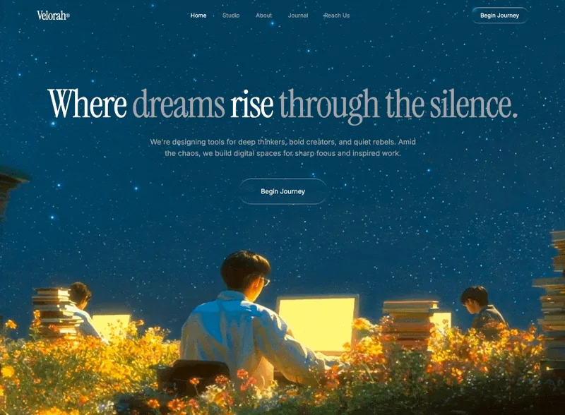
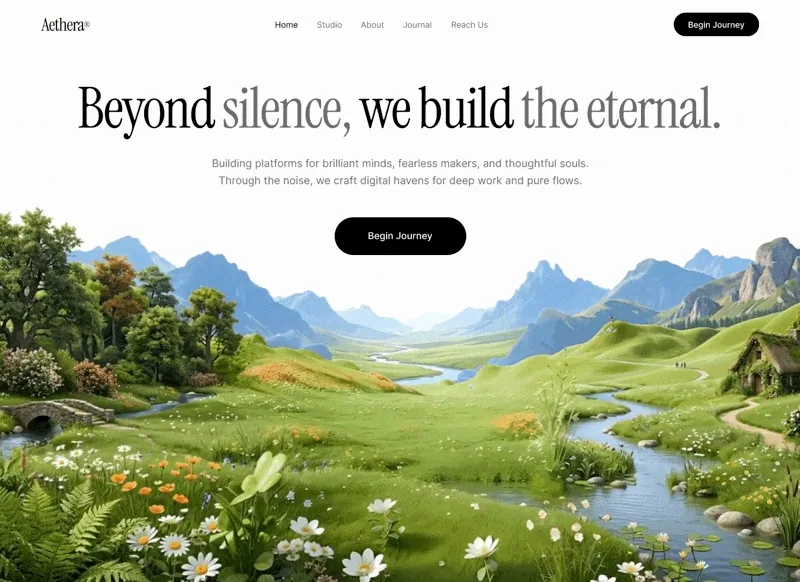
Create a single-page hero section with a fullscreen looping background video, glassmorphic navigation, and cinematic typography. Use React + Vite + Tailwind CSS + TypeScript with shadcn/ui. Video Background: Fullscreen <video> element with autoPlay, loop, muted, playsInline Source URL: https://d8j0ntlcm91z4.cloudfront.net/user_38xzZboKViGWJOttwIXH07lWA1P/hf_20260314_131748_f2ca2a28-fed7-44c8-b9a9-bd9acdd5ec31.mp4 Positioned absolute inset-0 w-full h-full object-cover z-0 Fonts: Import from Google Fonts: Instrumental Serif (display) and Inter weights 400/500 (body) CSS variables: --font-display: 'Instrument Serif', serif and --font-body: 'Inter', sans-serif Body uses var(--font-body), headings use inline fontFamily: "'Instrument Serif', serif" Color Theme (dark, HSL values for CSS variables): --background: 201 100% 13% (deep navy blue) --foreground: 0 0% 100% (white) --muted-foreground: 240 4% 66% (muted gray) --primary: 0 0% 100%, --primary-foreground: 0 0% 4% --secondary: 0 0% 10%, --muted: 0 0% 10%, --accent: 0 0% 10% --border: 0 0% 18%, --input: 0 0% 18% Navigation Bar: relative z-10, flex row, justify-between, px-8 py-6, max-w-7xl mx-auto Logo: "Velorah®" (® as <sup className="text-xs">), text-3xl tracking-tight, Instrument Serif font, text-foreground Nav links (hidden on mobile, md:flex): Home (active, text-foreground), Studio, About, Journal, Reach Us — all text-sm text-muted-foreground with hover:text-foreground transition-colors CTA button: "Begin Journey", liquid-glass rounded-full px-6 py-2.5 text-sm text-foreground, hover:scale-[1.03] Hero Section: relative z-10, flex column, centered, text-center, px-6 pt-32 pb-40 py-[90px] H1: "Where dreams rise through the silence." — text-5xl sm:text-7xl md:text-8xl, leading-[0.95], tracking-[-2.46px], max-w-7xl, font-normal, Instrument Serif. The words "dreams" and "through the silence." wrapped in <em className="not-italic text-muted-foreground"> for color contrast Subtext: text-muted-foreground text-base sm:text-lg max-w-2xl mt-8 leading-relaxed — "We're designing tools for deep thinkers, bold creators, and quiet rebels. Amid the chaos, we build digital spaces for sharp focus and inspired work." CTA button: "Begin Journey", liquid-glass rounded-full px-14 py-5 text-base text-foreground mt-12, hover:scale-[1.03] cursor-pointer Liquid Glass Effect (CSS class .liquid-glass): .liquid-glass { background: rgba(255, 255, 255, 0.01); background-blend-mode: luminosity; backdrop-filter: blur(4px); -webkit-backdrop-filter: blur(4px); border: none; box-shadow: inset 0 1px 1px rgba(255, 255, 255, 0.1); position: relative; overflow: hidden; } .liquid-glass::before { content: ''; position: absolute; inset: 0; border-radius: inherit; padding: 1.4px; background: linear-gradient(180deg, rgba(255,255,255,0.45) 0%, rgba(255,255,255,0.15) 20%, rgba(255,255,255,0) 40%, rgba(255,255,255,0) 60%, rgba(255,255,255,0.15) 80%, rgba(255,255,255,0.45) 100%); -webkit-mask: linear-gradient(#fff 0 0) content-box, linear-gradient(#fff 0 0); -webkit-mask-composite: xor; mask-composite: exclude; pointer-events: none; } Animations (CSS keyframes + classes): @keyframes fade-rise { from { opacity: 0; transform: translateY(24px); } to { opacity: 1; transform: translateY(0); } } .animate-fade-rise { animation: fade-rise 0.8s ease-out both; } .animate-fade-rise-delay { animation: fade-rise 0.8s ease-out 0.2s both; } .animate-fade-rise-delay-2 { animation: fade-rise 0.8s ease-out 0.4s both; } H1 gets animate-fade-rise Subtext gets animate-fade-rise-delay Hero CTA button gets animate-fade-rise-delay-2 Layout: No decorative blobs, radial gradients, or overlays. Minimalist, cinematic, vertically centered hero. The video provides all visual depth.

查看完整提示詞

完整原文提示詞

Create a single-page hero section with a fullscreen looping background video, glassmorphic navigation, and cinematic typography. Use React + Vite + Tailwind CSS + TypeScript with shadcn/ui. Video Background: Fullscreen <video> element with autoPlay, loop, muted, playsInline Source URL: https://d8j0ntlcm91z4.cloudfront.net/user_38xzZboKViGWJOttwIXH07lWA1P/hf_20260314_131748_f2ca2a28-fed7-44c8-b9a9-bd9acdd5ec31.mp4 Positioned absolute inset-0 w-full h-full object-cover z-0 Fonts: Import from Google Fonts: Instrumental Serif (display) and Inter weights 400/500 (body) CSS variables: --font-display: 'Instrument Serif', serif and --font-body: 'Inter', sans-serif Body uses var(--font-body), headings use inline fontFamily: "'Instrument Serif', serif" Color Theme (dark, HSL values for CSS variables): --background: 201 100% 13% (deep navy blue) --foreground: 0 0% 100% (white) --muted-foreground: 240 4% 66% (muted gray) --primary: 0 0% 100%, --primary-foreground: 0 0% 4% --secondary: 0 0% 10%, --muted: 0 0% 10%, --accent: 0 0% 10% --border: 0 0% 18%, --input: 0 0% 18% Navigation Bar: relative z-10, flex row, justify-between, px-8 py-6, max-w-7xl mx-auto Logo: "Velorah®" (® as <sup className="text-xs">), text-3xl tracking-tight, Instrument Serif font, text-foreground Nav links (hidden on mobile, md:flex): Home (active, text-foreground), Studio, About, Journal, Reach Us — all text-sm text-muted-foreground with hover:text-foreground transition-colors CTA button: "Begin Journey", liquid-glass rounded-full px-6 py-2.5 text-sm text-foreground, hover:scale-[1.03] Hero Section: relative z-10, flex column, centered, text-center, px-6 pt-32 pb-40 py-[90px] H1: "Where dreams rise through the silence." — text-5xl sm:text-7xl md:text-8xl, leading-[0.95], tracking-[-2.46px], max-w-7xl, font-normal, Instrument Serif. The words "dreams" and "through the silence." wrapped in <em className="not-italic text-muted-foreground"> for color contrast Subtext: text-muted-foreground text-base sm:text-lg max-w-2xl mt-8 leading-relaxed — "We're designing tools for deep thinkers, bold creators, and quiet rebels. Amid the chaos, we build digital spaces for sharp focus and inspired work." CTA button: "Begin Journey", liquid-glass rounded-full px-14 py-5 text-base text-foreground mt-12, hover:scale-[1.03] cursor-pointer Liquid Glass Effect (CSS class .liquid-glass): .liquid-glass { background: rgba(255, 255, 255, 0.01); background-blend-mode: luminosity; backdrop-filter: blur(4px); -webkit-backdrop-filter: blur(4px); border: none; box-shadow: inset 0 1px 1px rgba(255, 255, 255, 0.1); position: relative; overflow: hidden; } .liquid-glass::before { content: ''; position: absolute; inset: 0; border-radius: inherit; padding: 1.4px; background: linear-gradient(180deg, rgba(255,255,255,0.45) 0%, rgba(255,255,255,0.15) 20%, rgba(255,255,255,0) 40%, rgba(255,255,255,0) 60%, rgba(255,255,255,0.15) 80%, rgba(255,255,255,0.45) 100%); -webkit-mask: linear-gradient(#fff 0 0) content-box, linear-gradient(#fff 0 0); -webkit-mask-composite: xor; mask-composite: exclude; pointer-events: none; } Animations (CSS keyframes + classes): @keyframes fade-rise { from { opacity: 0; transform: translateY(24px); } to { opacity: 1; transform: translateY(0); } } .animate-fade-rise { animation: fade-rise 0.8s ease-out both; } .animate-fade-rise-delay { animation: fade-rise 0.8s ease-out 0.2s both; } .animate-fade-rise-delay-2 { animation: fade-rise 0.8s ease-out 0.4s both; } H1 gets animate-fade-rise Subtext gets animate-fade-rise-delay Hero CTA button gets animate-fade-rise-delay-2 Layout: No decorative blobs, radial gradients, or overlays. Minimalist, cinematic, vertically centered hero. The video provides all visual depth.

Aetheris Voyage 預覽
圖片資料庫編號 006

Aetheris Voyage

提示詞預覽

Build Prompt: Cinematic Space-Travel Landing Page Build a single-page landing site with two full-height sections (Hero + Capabilities), both using looping background videos with custom JS crossfade, a shared liquid-glass design system, and Framer Motion entrance animations. Tech stack (pinned, CDN-only) <script src="https://cdn.tailwindcss.com"></script> <script src="https://unpkg.com/react@18.3.1/umd/react.development.js" integrity="sha384-hD6/rw4ppMLGNu3tX5cjIb+uRZ7UkRJ6BPkLpg4hAu/6onKUg4lLsHAs9EBPT82L" crossorigin="anonymous"></script> <script src="https://unpkg.com/react-dom@18.3.1/umd/react-dom.development.js" integrity="sha384-u6aeetuaXnQ38mYT8rp6sbXaQe3NL9t+IBXmnYxwkUI2Hw4bsp2Wvmx4yRQF1uAm" crossorigin="anonymous"></script> <script src="https://unpkg.com/@babel/standalone@7.29.0/babel.min.js" integrity="sha384-m08KidiNqLdpJqLq95G/LEi8Qvjl/xUYll3QILypMoQ65QorJ9Lvtp2RXYGBFj1y" crossorigin="anonymous"></script> <script src="https://unpkg.com/framer-motion@11.11.17/dist/framer-motion.js"></script> <script>window.Motion = window.FramerMotion;</script> Body is bg: #000. Page is a React app mounted on #root, all components are <script type="text/babel"> files exporting via window.X = X. Fonts Google Fonts: family=Instrument+Serif:ital@0;1&family=Barlow:wght@300;400;500;600 Tailwind config adds: font-heading → 'Instrument Serif', serif (always italic in use) font-body → 'Barlow', sans-serif Default border radius override: DEFAULT: "9999px" (so bare rounded → pill). Liquid-glass utilities (exact CSS, in a <style> block) Two variants — .liquid-glass (subtle, for nav/chips/cards) and .liquid-glass-strong (heavier blur, for primary CTA): .liquid-glass { background: rgba(255,255,255,0.01); background-blend-mode: luminosity; backdrop-filter: blur(4px); -webkit-backdrop-filter: blur(4px); border: none; box-shadow: inset 0 1px 1px rgba(255,255,255,0.1); position: relative; overflow: hidden; } .liquid-glass::before { content: ""; position: absolute; inset: 0; border-radius: inherit; padding: 1.4px; background: linear-gradient(180deg, rgba(255,255,255,0.45) 0%, rgba(255,255,255,0.15) 20%, rgba(255,255,255,0) 40%, rgba(255,255,255,0) 60%, rgba(255,255,255,0.15) 80%, rgba(255,255,255,0.45) 100%); -webkit-mask: linear-gradient(#fff 0 0) content-box, linear-gradient(#fff 0 0); -webkit-mask-composite: xor; mask-composite: exclude; pointer-events: none; } .liquid-glass-strong { /* same but: */ backdrop-filter: blur(50px); box-shadow: 4px 4px 4px rgba(0,0,0,0.05), inset 0 1px 1px rgba(255,255,255,0.15); } .liquid-glass-strong::before { /* same but 0.5 / 0.2 / 0 / 0 / 0.2 / 0.5 stops */ } FadingVideo component (custom JS crossfade, no CSS transitions) Wraps a <video autoPlay muted playsInline preload="auto"> starting at opacity: 0. Behavior: FADE_MS = 500, FADE_OUT_LEAD = 0.55 seconds. fadeTo(target, duration) uses requestAnimationFrame; reads current opacity from http://video.style.opacity so each new fade resumes from wherever the last one left off. Each call calls cancelAnimationFrame on the previous rAF id before starting. On loadeddata: set opacity 0, play(), fadeTo(1). On timeupdate: if fadingOutRef not set and duration - currentTime <= 0.55 and > 0, flip the ref and fadeTo(0). On ended: set opacity 0; after setTimeout(100ms) reset currentTime = 0, play(), clear fadingOutRef, fadeTo(1). loop attribute is OFF (we implement looping manually via ended). Cleanup on unmount: cancel rAF, remove listeners. Section 1 — Hero (full viewport, black bg) Background video (120% width/height, top-aligned, centered horizontally — focal point is the top of frame): src: https://d8j0ntlcm91z4.cloudfront.net/user_38xzZboKViGWJOttwIXH07lWA1P/hf_20260418_080021_d598092b-c4c2-4e53-8e46-94cf9064cd50.mp4 class: absolute left-1/2 top-0 -translate-x-1/2 object-cover object-top z-0 style: { width: "120%", height: "120%" } No overlay. z-10 layer holds: Navbar → Hero content (flex-1, centered) → Partners. Navbar (fixed top-4, px-8 / lg:px-16, z-50) Left: 48×48 liquid-glass circle with italic serif lowercase "a" (Instrument Serif). Center (desktop only): liquid-glass pill, px-1.5 py-1.5, holding 5 text links — Home, Voyages, Worlds, Innovation, Plan Launch — each px-3 py-2 text-sm font-medium text-white/90 font-body. Followed by a white pill button Claim a Spot + ArrowUpRight icon (bg-white text-black, whitespace-nowrap). Right: 48×48 invisible spacer to balance logo. Hero content (centered, pt-24 px-4) All animated with Framer Motion, initial: {filter: blur(10px), opacity: 0, y: 20}, easeOut. Badge (delay 0.4s): liquid-glass rounded-full pill. Contains white pill chip "New" (bg-white text-black px-3 py-1 text-xs font-semibold) + text "Maiden Crewed Voyage to Mars Arrives 2026" (text-sm text-white/90, pr-3). Headline — BlurText component (word-by-word animation, see below). Text: "Venture Past Our Sky Across the Universe". Classes: text-6xl md:text-7xl lg:text-[5.5rem] font-heading italic text-white leading-[0.8] max-w-2xl justify-center tracking-[-4px]. Subheading (delay 0.8s, mt-4 text-sm md:text-base text-white max-w-2xl font-body font-light leading-tight): "Discover the universe in ways once unimaginable. Our pioneering vessels and breakthrough engineering bring deep-space exploration within reach—secure and extraordinary." CTAs (delay 1.1s, flex items-center gap-6 mt-6): Primary: liquid-glass-strong rounded-full px-5 py-2.5 text-sm font-medium text-white with "Start Your Voyage" + ArrowUpRight (h-5 w-5). Secondary: bare text link, "View Liftoff" + Play icon (h-4 w-4, filled). Stats row (delay 1.3s, flex items-stretch gap-4 mt-8): two liquid-glass cards, p-5 w-[220px] rounded-[1.25rem], each: Top: white 28×28 outline SVG icon (clock for card 1, globe for card 2). Bottom: large number in Instrument Serif italic white (text-4xl tracking-[-1px] leading-none): "34.5 Min" / "2.8B+". Label below (text-xs text-white font-body font-light mt-2): "Average Videos Watch Time" / "Users Across the Globe". Partners (bottom of hero, delay 1.4s) flex flex-col items-center gap-4 pb-8: liquid-glass rounded-full chip (px-3.5 py-1 text-xs font-medium text-white): "Collaborating with top aerospace pioneers globally". Row of 5 names in Instrument Serif italic white, text-2xl md:text-3xl tracking-tight, gap-12/md:gap-16: Aeon · Vela · Apex · Orbit · Zeno. BlurText component (word-by-word blur-in) IntersectionObserver triggers on 10% visibility. Splits text by spaces. Each word is a motion.span with: initial: {filter: 'blur(10px)', opacity: 0, y: 50} 3-step keyframes to {filter: 'blur(5px)', opacity: 0.5, y: -5} → {filter: 'blur(0px)', opacity: 1, y: 0} duration: 0.7 (stepDuration 0.35 × 2), times: [0, 0.5, 1], ease: easeOut Stagger: delay = (i * 100) / 1000 seconds display: inline-block, marginRight: 0.28em (not non-breaking-space — letter-spacing -4px eats nbsp). Parent <p> is display: flex; flexWrap: wrap; justifyContent: center; rowGap: 0.1em. Section 2 — Capabilities (min-h-screen, black bg) Background video (full-bleed, no 120% scale): src: https://d8j0ntlcm91z4.cloudfront.net/user_38xzZboKViGWJOttwIXH07lWA1P/hf_20260418_094631_d30ab262-45ee-4b7d-99f3-5d5848c8ef13.mp4 class: absolute inset-0 w-full h-full object-cover z-0 Same FadingVideo treatment. No overlay. Content (relative z-10 px-8 md:px-16 lg:px-20 pt-24 pb-10 flex flex-col min-h-screen): Header (mb-auto): Kicker: text-sm font-body text-white/80 mb-6 → // Capabilities Heading: font-heading italic text-white text-6xl md:text-7xl lg:text-[6rem] leading-[0.9] tracking-[-3px]: Production evolved (two lines, <br/> between). Three cards (grid grid-cols-1 md:grid-cols-3 gap-6 mt-16): each is liquid-glass rounded-[1.25rem] p-6 min-h-[360px] flex flex-col. Top row of each card (flex items-start justify-between gap-4): Left: 44×44 nested liquid-glass square (rounded-[0.75rem]) with a white Material Icons SVG (fill currentColor, h-6 w-6 text-white). Use random Material icons — these three used: AI Scenery: image icon — path M5 21q-.825 0-1.412-.587T3 19V5q0-.825.588-1.412T5 3h14q.825 0 1.413.588T21 5v14q0 .825-.587 1.413T19 21H5Zm1-4h12l-3.75-5-3 4L9 13l-3 4Z Batch Production: movie icon — path M4 6.47 5.76 10H20v8H4V6.47M22 4h-4l2 4h-3l-2-4h-2l2 4h-3l-2-4H8l2 4H7L5 4H4c-1.1 0-1.99.89-1.99 2L2 18c0 1.1.9 2 2 2h16c1.1 0 2-.9 2-2V4Z Smart Lighting: lightbulb icon — path M9 21c0 .55.45 1 1 1h4c.55 0 1-.45 1-1v-1H9v1Zm3-19C8.14 2 5 5.14 5 9c0 2.38 1.19 4.47 3 5.74V17c0 .55.45 1 1 1h6c.55 0 1-.45 1-1v-2.26c1.81-1.27 3-3.36 3-5.74 0-3.86-3.14-7-7-7Z Right: flex flex-wrap justify-end gap-1.5 max-w-[70%] — 4 small liquid-glass pill tags (rounded-full px-3 py-1 text-[11px] text-white/90 font-body whitespace-nowrap): Card 1: Natural Context · Photo Realism · Infinite Settings · Eco-Vibe Card 2: Scale Fast · Visual Consistency · Time Saver · Ready to Post Card 3: Ray Tracing · Physical Shadows · Studio Quality · Sunlight Sync Middle: flex-1 spacer. Bottom of each card (mt-6): Title h3: font-heading italic text-white text-3xl md:text-4xl tracking-[-1px] leading-none — "AI Scenery" / "Batch Production" / "Smart Lighting" Body p (mt-3 text-sm text-white/90 font-body font-light leading-snug max-w-[32ch]): "AI analyzes your product to create indistinguishable natural environments — from Icelandic cliffs to misty forests." "Style your entire product line in minutes. Create a unified visual identity for catalogues and social media without weeks of retouching." "Automatic lighting and material adjustment. Achieve flawless integration with realistic shadows and sunlight." Icons (inline lucide-style SVGs, currentColor stroke) ArrowUpRight: 24×24, M7 17L17 7 + M7 7h10v10, strokeWidth 2, round caps. Play: 24×24 filled polygon 6 4 20 12 6 20 6 4. Notes All text white; no green, no gradient backgrounds. No CSS transitions on the videos — fades must be rAF-driven per the FadingVideo spec. Videos are full-bleed with no dark overlay; contrast comes from the liquid-glass chrome. Framer Motion dev warnings about list keys can be suppressed with a console.error filter wrapper — they're benign. The detailed prompt above captures every element, style, animation, video URL, and font to recreate the landing page exactly.

查看完整提示詞

完整原文提示詞

Build Prompt: Cinematic Space-Travel Landing Page Build a single-page landing site with two full-height sections (Hero + Capabilities), both using looping background videos with custom JS crossfade, a shared liquid-glass design system, and Framer Motion entrance animations. Tech stack (pinned, CDN-only) <script src="https://cdn.tailwindcss.com"></script> <script src="https://unpkg.com/react@18.3.1/umd/react.development.js" integrity="sha384-hD6/rw4ppMLGNu3tX5cjIb+uRZ7UkRJ6BPkLpg4hAu/6onKUg4lLsHAs9EBPT82L" crossorigin="anonymous"></script> <script src="https://unpkg.com/react-dom@18.3.1/umd/react-dom.development.js" integrity="sha384-u6aeetuaXnQ38mYT8rp6sbXaQe3NL9t+IBXmnYxwkUI2Hw4bsp2Wvmx4yRQF1uAm" crossorigin="anonymous"></script> <script src="https://unpkg.com/@babel/standalone@7.29.0/babel.min.js" integrity="sha384-m08KidiNqLdpJqLq95G/LEi8Qvjl/xUYll3QILypMoQ65QorJ9Lvtp2RXYGBFj1y" crossorigin="anonymous"></script> <script src="https://unpkg.com/framer-motion@11.11.17/dist/framer-motion.js"></script> <script>window.Motion = window.FramerMotion;</script> Body is bg: #000. Page is a React app mounted on #root, all components are <script type="text/babel"> files exporting via window.X = X. Fonts Google Fonts: family=Instrument+Serif:ital@0;1&family=Barlow:wght@300;400;500;600 Tailwind config adds: font-heading → 'Instrument Serif', serif (always italic in use) font-body → 'Barlow', sans-serif Default border radius override: DEFAULT: "9999px" (so bare rounded → pill). Liquid-glass utilities (exact CSS, in a <style> block) Two variants — .liquid-glass (subtle, for nav/chips/cards) and .liquid-glass-strong (heavier blur, for primary CTA): .liquid-glass { background: rgba(255,255,255,0.01); background-blend-mode: luminosity; backdrop-filter: blur(4px); -webkit-backdrop-filter: blur(4px); border: none; box-shadow: inset 0 1px 1px rgba(255,255,255,0.1); position: relative; overflow: hidden; } .liquid-glass::before { content: ""; position: absolute; inset: 0; border-radius: inherit; padding: 1.4px; background: linear-gradient(180deg, rgba(255,255,255,0.45) 0%, rgba(255,255,255,0.15) 20%, rgba(255,255,255,0) 40%, rgba(255,255,255,0) 60%, rgba(255,255,255,0.15) 80%, rgba(255,255,255,0.45) 100%); -webkit-mask: linear-gradient(#fff 0 0) content-box, linear-gradient(#fff 0 0); -webkit-mask-composite: xor; mask-composite: exclude; pointer-events: none; } .liquid-glass-strong { /* same but: */ backdrop-filter: blur(50px); box-shadow: 4px 4px 4px rgba(0,0,0,0.05), inset 0 1px 1px rgba(255,255,255,0.15); } .liquid-glass-strong::before { /* same but 0.5 / 0.2 / 0 / 0 / 0.2 / 0.5 stops */ } FadingVideo component (custom JS crossfade, no CSS transitions) Wraps a <video autoPlay muted playsInline preload="auto"> starting at opacity: 0. Behavior: FADE_MS = 500, FADE_OUT_LEAD = 0.55 seconds. fadeTo(target, duration) uses requestAnimationFrame; reads current opacity from http://video.style.opacity so each new fade resumes from wherever the last one left off. Each call calls cancelAnimationFrame on the previous rAF id before starting. On loadeddata: set opacity 0, play(), fadeTo(1). On timeupdate: if fadingOutRef not set and duration - currentTime <= 0.55 and > 0, flip the ref and fadeTo(0). On ended: set opacity 0; after setTimeout(100ms) reset currentTime = 0, play(), clear fadingOutRef, fadeTo(1). loop attribute is OFF (we implement looping manually via ended). Cleanup on unmount: cancel rAF, remove listeners. Section 1 — Hero (full viewport, black bg) Background video (120% width/height, top-aligned, centered horizontally — focal point is the top of frame): src: https://d8j0ntlcm91z4.cloudfront.net/user_38xzZboKViGWJOttwIXH07lWA1P/hf_20260418_080021_d598092b-c4c2-4e53-8e46-94cf9064cd50.mp4 class: absolute left-1/2 top-0 -translate-x-1/2 object-cover object-top z-0 style: { width: "120%", height: "120%" } No overlay. z-10 layer holds: Navbar → Hero content (flex-1, centered) → Partners. Navbar (fixed top-4, px-8 / lg:px-16, z-50) Left: 48×48 liquid-glass circle with italic serif lowercase "a" (Instrument Serif). Center (desktop only): liquid-glass pill, px-1.5 py-1.5, holding 5 text links — Home, Voyages, Worlds, Innovation, Plan Launch — each px-3 py-2 text-sm font-medium text-white/90 font-body. Followed by a white pill button Claim a Spot + ArrowUpRight icon (bg-white text-black, whitespace-nowrap). Right: 48×48 invisible spacer to balance logo. Hero content (centered, pt-24 px-4) All animated with Framer Motion, initial: {filter: blur(10px), opacity: 0, y: 20}, easeOut. Badge (delay 0.4s): liquid-glass rounded-full pill. Contains white pill chip "New" (bg-white text-black px-3 py-1 text-xs font-semibold) + text "Maiden Crewed Voyage to Mars Arrives 2026" (text-sm text-white/90, pr-3). Headline — BlurText component (word-by-word animation, see below). Text: "Venture Past Our Sky Across the Universe". Classes: text-6xl md:text-7xl lg:text-[5.5rem] font-heading italic text-white leading-[0.8] max-w-2xl justify-center tracking-[-4px]. Subheading (delay 0.8s, mt-4 text-sm md:text-base text-white max-w-2xl font-body font-light leading-tight): "Discover the universe in ways once unimaginable. Our pioneering vessels and breakthrough engineering bring deep-space exploration within reach—secure and extraordinary." CTAs (delay 1.1s, flex items-center gap-6 mt-6): Primary: liquid-glass-strong rounded-full px-5 py-2.5 text-sm font-medium text-white with "Start Your Voyage" + ArrowUpRight (h-5 w-5). Secondary: bare text link, "View Liftoff" + Play icon (h-4 w-4, filled). Stats row (delay 1.3s, flex items-stretch gap-4 mt-8): two liquid-glass cards, p-5 w-[220px] rounded-[1.25rem], each: Top: white 28×28 outline SVG icon (clock for card 1, globe for card 2). Bottom: large number in Instrument Serif italic white (text-4xl tracking-[-1px] leading-none): "34.5 Min" / "2.8B+". Label below (text-xs text-white font-body font-light mt-2): "Average Videos Watch Time" / "Users Across the Globe". Partners (bottom of hero, delay 1.4s) flex flex-col items-center gap-4 pb-8: liquid-glass rounded-full chip (px-3.5 py-1 text-xs font-medium text-white): "Collaborating with top aerospace pioneers globally". Row of 5 names in Instrument Serif italic white, text-2xl md:text-3xl tracking-tight, gap-12/md:gap-16: Aeon · Vela · Apex · Orbit · Zeno. BlurText component (word-by-word blur-in) IntersectionObserver triggers on 10% visibility. Splits text by spaces. Each word is a motion.span with: initial: {filter: 'blur(10px)', opacity: 0, y: 50} 3-step keyframes to {filter: 'blur(5px)', opacity: 0.5, y: -5} → {filter: 'blur(0px)', opacity: 1, y: 0} duration: 0.7 (stepDuration 0.35 × 2), times: [0, 0.5, 1], ease: easeOut Stagger: delay = (i * 100) / 1000 seconds display: inline-block, marginRight: 0.28em (not non-breaking-space — letter-spacing -4px eats nbsp). Parent <p> is display: flex; flexWrap: wrap; justifyContent: center; rowGap: 0.1em. Section 2 — Capabilities (min-h-screen, black bg) Background video (full-bleed, no 120% scale): src: https://d8j0ntlcm91z4.cloudfront.net/user_38xzZboKViGWJOttwIXH07lWA1P/hf_20260418_094631_d30ab262-45ee-4b7d-99f3-5d5848c8ef13.mp4 class: absolute inset-0 w-full h-full object-cover z-0 Same FadingVideo treatment. No overlay. Content (relative z-10 px-8 md:px-16 lg:px-20 pt-24 pb-10 flex flex-col min-h-screen): Header (mb-auto): Kicker: text-sm font-body text-white/80 mb-6 → // Capabilities Heading: font-heading italic text-white text-6xl md:text-7xl lg:text-[6rem] leading-[0.9] tracking-[-3px]: Production evolved (two lines, <br/> between). Three cards (grid grid-cols-1 md:grid-cols-3 gap-6 mt-16): each is liquid-glass rounded-[1.25rem] p-6 min-h-[360px] flex flex-col. Top row of each card (flex items-start justify-between gap-4): Left: 44×44 nested liquid-glass square (rounded-[0.75rem]) with a white Material Icons SVG (fill currentColor, h-6 w-6 text-white). Use random Material icons — these three used: AI Scenery: image icon — path M5 21q-.825 0-1.412-.587T3 19V5q0-.825.588-1.412T5 3h14q.825 0 1.413.588T21 5v14q0 .825-.587 1.413T19 21H5Zm1-4h12l-3.75-5-3 4L9 13l-3 4Z Batch Production: movie icon — path M4 6.47 5.76 10H20v8H4V6.47M22 4h-4l2 4h-3l-2-4h-2l2 4h-3l-2-4H8l2 4H7L5 4H4c-1.1 0-1.99.89-1.99 2L2 18c0 1.1.9 2 2 2h16c1.1 0 2-.9 2-2V4Z Smart Lighting: lightbulb icon — path M9 21c0 .55.45 1 1 1h4c.55 0 1-.45 1-1v-1H9v1Zm3-19C8.14 2 5 5.14 5 9c0 2.38 1.19 4.47 3 5.74V17c0 .55.45 1 1 1h6c.55 0 1-.45 1-1v-2.26c1.81-1.27 3-3.36 3-5.74 0-3.86-3.14-7-7-7Z Right: flex flex-wrap justify-end gap-1.5 max-w-[70%] — 4 small liquid-glass pill tags (rounded-full px-3 py-1 text-[11px] text-white/90 font-body whitespace-nowrap): Card 1: Natural Context · Photo Realism · Infinite Settings · Eco-Vibe Card 2: Scale Fast · Visual Consistency · Time Saver · Ready to Post Card 3: Ray Tracing · Physical Shadows · Studio Quality · Sunlight Sync Middle: flex-1 spacer. Bottom of each card (mt-6): Title h3: font-heading italic text-white text-3xl md:text-4xl tracking-[-1px] leading-none — "AI Scenery" / "Batch Production" / "Smart Lighting" Body p (mt-3 text-sm text-white/90 font-body font-light leading-snug max-w-[32ch]): "AI analyzes your product to create indistinguishable natural environments — from Icelandic cliffs to misty forests." "Style your entire product line in minutes. Create a unified visual identity for catalogues and social media without weeks of retouching." "Automatic lighting and material adjustment. Achieve flawless integration with realistic shadows and sunlight." Icons (inline lucide-style SVGs, currentColor stroke) ArrowUpRight: 24×24, M7 17L17 7 + M7 7h10v10, strokeWidth 2, round caps. Play: 24×24 filled polygon 6 4 20 12 6 20 6 4. Notes All text white; no green, no gradient backgrounds. No CSS transitions on the videos — fades must be rAF-driven per the FadingVideo spec. Videos are full-bleed with no dark overlay; contrast comes from the liquid-glass chrome. Framer Motion dev warnings about list keys can be suppressed with a console.error filter wrapper — they're benign. The detailed prompt above captures every element, style, animation, video URL, and font to recreate the landing page exactly.

動態預覽只會在你選擇播放後載入。

影片資料庫編號 007

VEX Ventures

提示詞預覽

Recreate this hero section exactly. Here are the complete specifications: Video Background: Full-screen background video, absolutely positioned, covering the entire viewport (object-cover) Video URL: https://d8j0ntlcm91z4.cloudfront.net/user_38xzZboKViGWJOttwIXH07lWA1P/hf_20260403_050628_c4e32401-fab4-4a27-b7a8-6e9291cd5959.mp4 Autoplay, loop, muted, playsInline NO dark overlay, NO gradient overlay, NO semi-transparent layer on top of the video. The video plays raw with no dimming whatsoever. Typography (CRITICAL - must be applied globally): Import the Google Font Inter via a <link> tag in index.html: <link rel="preconnect" href="https://fonts.googleapis.com"> <link rel="preconnect" href="https://fonts.gstatic.com" crossorigin> <link href="https://fonts.googleapis.com/css2?family=Inter:wght@300;400;500;600&display=swap" rel="stylesheet"> Set the body font-family in CSS to: 'Inter', sans-serif Apply -webkit-font-smoothing: antialiased and -moz-osx-font-smoothing: grayscale on the body Also extend the Tailwind config to set fontFamily: { sans: ['Inter', 'sans-serif'] } so all Tailwind font-sans usage picks up Inter automatically Navbar: Wrapped in horizontal page padding: px-6 md:px-12 lg:px-16 with pt-6 top padding The navbar bar itself uses the .liquid-glass class and has rounded-xl, px-4 py-2, flex layout with items-center justify-between Left: Logo text "VEX" - text-2xl font-semibold tracking-tight Center (hidden on mobile, visible md+): Links "Story", "Investing", "Building", "Advisory" - text-sm, gap-8, hover transitions to gray-300 Right: "Start a Chat" button - bg-white text-black px-6 py-2 rounded-lg text-sm font-medium, hover to gray-100 Hero Content (Bottom of viewport): Container: same horizontal padding as navbar, flex column filling remaining height, content pushed to bottom with flex-1 flex flex-col justify-end, bottom padding pb-12 lg:pb-16 On large screens: 2-column grid (lg:grid lg:grid-cols-2 lg:items-end) Left Column - Main content: Heading: "Shaping tomorrow\nwith vision and action." (literal line break between "tomorrow" and "with") Responsive sizes: text-4xl md:text-5xl lg:text-6xl xl:text-7xl font-normal, mb-4 Inline style: letterSpacing: '-0.04em' Character-by-character entrance animation: Each character starts at opacity: 0 and translateX(-18px), then transitions to opacity: 1 and translateX(0). Each character gets a staggered delay calculated as: (lineIndex * lineLength * charDelay) + (charIndex * charDelay) where charDelay = 30ms. The whole animation starts after 200ms initial delay. Each character transition is 500ms. Spaces render as \u00A0 (non-breaking space) Subheading: "We back visionaries and craft ventures that define what comes next." text-base md:text-lg text-gray-300 mb-5 Fade-in animation: starts at 800ms delay, 1000ms duration Buttons row: flex-wrap with gap-4 "Start a Chat" - bg-white text-black px-8 py-3 rounded-lg font-medium "Explore Now" - liquid-glass border border-white/20 text-white px-8 py-3 rounded-lg font-medium, hover transitions to white bg + black text Fade-in animation: starts at 1200ms delay, 1000ms duration Right Column - Tag: Aligned to bottom-right on large screens (flex items-end justify-start lg:justify-end) Glass card: liquid-glass border border-white/20 px-6 py-3 rounded-xl Text: "Investing. Building. Advisory." - text-lg md:text-xl lg:text-2xl font-light Fade-in animation: starts at 1400ms delay, 1000ms duration Liquid Glass CSS (place in global CSS): .liquid-glass { background: rgba(0, 0, 0, 0.4); background-blend-mode: luminosity; backdrop-filter: blur(4px); -webkit-backdrop-filter: blur(4px); border: none; box-shadow: inset 0 1px 1px rgba(255, 255, 255, 0.1); position: relative; overflow: hidden; } .liquid-glass::before { content: ''; position: absolute; inset: 0; border-radius: inherit; padding: 1.4px; background: linear-gradient(180deg, rgba(255,255,255,0.3) 0%, rgba(255,255,255,0.1) 20%, rgba(255,255,255,0) 40%, rgba(255,255,255,0) 60%, rgba(255,255,255,0.1) 80%, rgba(255,255,255,0.3) 100%); -webkit-mask: linear-gradient(#fff 0 0) content-box, linear-gradient(#fff 0 0); -webkit-mask-composite: xor; mask-composite: exclude; pointer-events: none; } FadeIn component: A wrapper that starts with opacity: 0 and transitions to opacity: 1 after a configurable delay (ms) using a setTimeout + React state. Transition duration is also configurable. Uses inline transitionDuration style and Tailwind's transition-opacity class. AnimatedHeading component: Splits text by \n into lines, then each line into individual characters. Each character is an inline-block <span> with CSS transitions on opacity and transform (translateX). Animation triggers via React state after the initial delay. Color scheme: Black background, white text, gray-300 for secondary text, white/20 for borders. No purple, no indigo. Stack: React + TypeScript, Tailwind CSS, Vite. No extra UI libraries needed. Icons from lucide-react if needed (none currently used in the hero).

查看完整提示詞

完整原文提示詞

Recreate this hero section exactly. Here are the complete specifications: Video Background: Full-screen background video, absolutely positioned, covering the entire viewport (object-cover) Video URL: https://d8j0ntlcm91z4.cloudfront.net/user_38xzZboKViGWJOttwIXH07lWA1P/hf_20260403_050628_c4e32401-fab4-4a27-b7a8-6e9291cd5959.mp4 Autoplay, loop, muted, playsInline NO dark overlay, NO gradient overlay, NO semi-transparent layer on top of the video. The video plays raw with no dimming whatsoever. Typography (CRITICAL - must be applied globally): Import the Google Font Inter via a <link> tag in index.html: <link rel="preconnect" href="https://fonts.googleapis.com"> <link rel="preconnect" href="https://fonts.gstatic.com" crossorigin> <link href="https://fonts.googleapis.com/css2?family=Inter:wght@300;400;500;600&display=swap" rel="stylesheet"> Set the body font-family in CSS to: 'Inter', sans-serif Apply -webkit-font-smoothing: antialiased and -moz-osx-font-smoothing: grayscale on the body Also extend the Tailwind config to set fontFamily: { sans: ['Inter', 'sans-serif'] } so all Tailwind font-sans usage picks up Inter automatically Navbar: Wrapped in horizontal page padding: px-6 md:px-12 lg:px-16 with pt-6 top padding The navbar bar itself uses the .liquid-glass class and has rounded-xl, px-4 py-2, flex layout with items-center justify-between Left: Logo text "VEX" - text-2xl font-semibold tracking-tight Center (hidden on mobile, visible md+): Links "Story", "Investing", "Building", "Advisory" - text-sm, gap-8, hover transitions to gray-300 Right: "Start a Chat" button - bg-white text-black px-6 py-2 rounded-lg text-sm font-medium, hover to gray-100 Hero Content (Bottom of viewport): Container: same horizontal padding as navbar, flex column filling remaining height, content pushed to bottom with flex-1 flex flex-col justify-end, bottom padding pb-12 lg:pb-16 On large screens: 2-column grid (lg:grid lg:grid-cols-2 lg:items-end) Left Column - Main content: Heading: "Shaping tomorrow\nwith vision and action." (literal line break between "tomorrow" and "with") Responsive sizes: text-4xl md:text-5xl lg:text-6xl xl:text-7xl font-normal, mb-4 Inline style: letterSpacing: '-0.04em' Character-by-character entrance animation: Each character starts at opacity: 0 and translateX(-18px), then transitions to opacity: 1 and translateX(0). Each character gets a staggered delay calculated as: (lineIndex * lineLength * charDelay) + (charIndex * charDelay) where charDelay = 30ms. The whole animation starts after 200ms initial delay. Each character transition is 500ms. Spaces render as \u00A0 (non-breaking space) Subheading: "We back visionaries and craft ventures that define what comes next." text-base md:text-lg text-gray-300 mb-5 Fade-in animation: starts at 800ms delay, 1000ms duration Buttons row: flex-wrap with gap-4 "Start a Chat" - bg-white text-black px-8 py-3 rounded-lg font-medium "Explore Now" - liquid-glass border border-white/20 text-white px-8 py-3 rounded-lg font-medium, hover transitions to white bg + black text Fade-in animation: starts at 1200ms delay, 1000ms duration Right Column - Tag: Aligned to bottom-right on large screens (flex items-end justify-start lg:justify-end) Glass card: liquid-glass border border-white/20 px-6 py-3 rounded-xl Text: "Investing. Building. Advisory." - text-lg md:text-xl lg:text-2xl font-light Fade-in animation: starts at 1400ms delay, 1000ms duration Liquid Glass CSS (place in global CSS): .liquid-glass { background: rgba(0, 0, 0, 0.4); background-blend-mode: luminosity; backdrop-filter: blur(4px); -webkit-backdrop-filter: blur(4px); border: none; box-shadow: inset 0 1px 1px rgba(255, 255, 255, 0.1); position: relative; overflow: hidden; } .liquid-glass::before { content: ''; position: absolute; inset: 0; border-radius: inherit; padding: 1.4px; background: linear-gradient(180deg, rgba(255,255,255,0.3) 0%, rgba(255,255,255,0.1) 20%, rgba(255,255,255,0) 40%, rgba(255,255,255,0) 60%, rgba(255,255,255,0.1) 80%, rgba(255,255,255,0.3) 100%); -webkit-mask: linear-gradient(#fff 0 0) content-box, linear-gradient(#fff 0 0); -webkit-mask-composite: xor; mask-composite: exclude; pointer-events: none; } FadeIn component: A wrapper that starts with opacity: 0 and transitions to opacity: 1 after a configurable delay (ms) using a setTimeout + React state. Transition duration is also configurable. Uses inline transitionDuration style and Tailwind's transition-opacity class. AnimatedHeading component: Splits text by \n into lines, then each line into individual characters. Each character is an inline-block <span> with CSS transitions on opacity and transform (translateX). Animation triggers via React state after the initial delay. Color scheme: Black background, white text, gray-300 for secondary text, white/20 for borders. No purple, no indigo. Stack: React + TypeScript, Tailwind CSS, Vite. No extra UI libraries needed. Icons from lucide-react if needed (none currently used in the hero).

動態預覽只會在你選擇播放後載入。

影片資料庫編號 008

SkyElite Private Jets

提示詞預覽

Create a premium private jet landing page hero section with the following specifications: Video Background: Use this exact CloudFront video URL: https://d8j0ntlcm91z4.cloudfront.net/user_38xzZboKViGWJOttwIXH07lWA1P/hf_20260328_091828_e240eb17-6edc-4129-ad9d-98678e3fd238.mp4 Video should autoplay, be muted, loop continuously, and include playsInline attribute Video covers entire viewport (100vh) using object-cover Navigation Bar: Brand name "SkyElite" on the left (text-2xl, font-semibold, text-gray-900) Desktop menu items (hidden on mobile, visible md:flex): Start, Story, Rates, Benefits, FAQ Navigation links in gray-900 with hover:text-gray-700 transition Mobile hamburger menu button using Lucide React icons (Menu/X) Mobile menu appears as dropdown with white/95 opacity background, backdrop blur, rounded corners, shadow Max width 7xl, centered with px-8 py-6 Hero Content (centered, -mt-80 to pull up): Small uppercase label: "PRIVATE JETS" (text-sm, font-semibold, gray-600, tracking-wider, mb-4) Large two-line heading with overlapping effect: Line 1: "Premium." (text-6xl md:text-7xl lg:text-8xl, font-normal, text-gray-500, leading-none, tracking-tighter) Line 2: "Accessible." (same size, color: #202A36, negative margin-top: -12px for overlap) Subtitle: "Your dedication deserves recognition." (text-lg md:text-xl, gray-600, mb-6, max-w-2xl) Two call-to-action buttons (gap-4, centered): "Discover" button: px-4 py-2, rounded-full, bg-gray-300, text-gray-800, font-medium, hover:bg-gray-400 "Book Now" button: px-4 py-2, rounded-full, white text, bg-color #202A36, hover color #1a2229 with smooth transitions Typography: Use Inter font (import from Google Fonts: 400, 500, 600, 700 weights) Apply to entire body via CSS Technical Setup: React with TypeScript Tailwind CSS for styling Lucide React for icons useState hook for mobile menu toggle Full screen height container (h-screen) Responsive breakpoints: mobile-first, md, lg All transitions use transition-colors class Layout Structure: Outer container: min-h-screen, bg-gray-50 Hero section: relative, h-screen, overflow-hidden Content wrapper: relative, h-full, flex flex-col Main content area: flex-1, flex items-center justify-center Make it clean, modern, and premium-looking with smooth interactions.

查看完整提示詞

完整原文提示詞

Create a premium private jet landing page hero section with the following specifications: Video Background: Use this exact CloudFront video URL: https://d8j0ntlcm91z4.cloudfront.net/user_38xzZboKViGWJOttwIXH07lWA1P/hf_20260328_091828_e240eb17-6edc-4129-ad9d-98678e3fd238.mp4 Video should autoplay, be muted, loop continuously, and include playsInline attribute Video covers entire viewport (100vh) using object-cover Navigation Bar: Brand name "SkyElite" on the left (text-2xl, font-semibold, text-gray-900) Desktop menu items (hidden on mobile, visible md:flex): Start, Story, Rates, Benefits, FAQ Navigation links in gray-900 with hover:text-gray-700 transition Mobile hamburger menu button using Lucide React icons (Menu/X) Mobile menu appears as dropdown with white/95 opacity background, backdrop blur, rounded corners, shadow Max width 7xl, centered with px-8 py-6 Hero Content (centered, -mt-80 to pull up): Small uppercase label: "PRIVATE JETS" (text-sm, font-semibold, gray-600, tracking-wider, mb-4) Large two-line heading with overlapping effect: Line 1: "Premium." (text-6xl md:text-7xl lg:text-8xl, font-normal, text-gray-500, leading-none, tracking-tighter) Line 2: "Accessible." (same size, color: #202A36, negative margin-top: -12px for overlap) Subtitle: "Your dedication deserves recognition." (text-lg md:text-xl, gray-600, mb-6, max-w-2xl) Two call-to-action buttons (gap-4, centered): "Discover" button: px-4 py-2, rounded-full, bg-gray-300, text-gray-800, font-medium, hover:bg-gray-400 "Book Now" button: px-4 py-2, rounded-full, white text, bg-color #202A36, hover color #1a2229 with smooth transitions Typography: Use Inter font (import from Google Fonts: 400, 500, 600, 700 weights) Apply to entire body via CSS Technical Setup: React with TypeScript Tailwind CSS for styling Lucide React for icons useState hook for mobile menu toggle Full screen height container (h-screen) Responsive breakpoints: mobile-first, md, lg All transitions use transition-colors class Layout Structure: Outer container: min-h-screen, bg-gray-50 Hero section: relative, h-screen, overflow-hidden Content wrapper: relative, h-full, flex flex-col Main content area: flex-1, flex items-center justify-center Make it clean, modern, and premium-looking with smooth interactions.

動態預覽只會在你選擇播放後載入。

影片資料庫編號 009

Modern Agency

提示詞預覽

Build a React + Vite + Tailwind CSS landing page for "Axion Studio" - a design agency site. Use the `shaders` package (npm: `shaders`) for the hero background, `lucide-react` for icons. The page has 3 sections. Match every detail exactly: --- ## SECTION 1: HERO (Full viewport height) **Background:** Light gray `#EFEFEF` with a full-screen animated shader overlay (positioned absolute, inset-0, z-10, pointer-events-none). The shader stack uses components from `shaders/react`: - `Swirl` - colorA: `#ffffff`, colorB: `#f0f0f0`, detail: 1.7 - `ChromaFlow` - baseColor: `#ffffff`, downColor/leftColor/rightColor/upColor: `#ff5f03`, momentum: 13, radius: 3.5 - `FlutedGlass` - aberration: 0.61, angle: 31, frequency: 8, highlight: 0.12, highlightSoftness: 0, lightAngle: -90, refraction: 4, shape: "rounded", softness: 1, speed: 0.15 - `FilmGrain` - strength: 0.05 **Navigation (z-20, relative):** A pill-shaped white navbar (`bg-white rounded-full`) with 5px padding, inside a max-w-[1440px] container with p-2 sm:p-3. - LEFT: Dark circle logo (w-9 h-9 sm:w-10 sm:h-10, bg-gray-900, rounded-full) with white text "AX" (10px/11px, font-bold, tracking-tight). Next to it (hidden on mobile, shown md+): nav links "Projects", "Studio", "Journal", "Connect" - 14px, text-gray-900, hover:text-gray-500, transition-colors duration-300, gap-6. - RIGHT (hidden on mobile, shown md+): - Text "Taking on projects for Q1 2026" (13px, text-gray-600, hidden below lg) - Clock icon (lucide, size 14) + live London time "{HH:MM} in London" (13px, text-gray-600) - CTA button: bg-gray-900, text-white, 13px font-medium, rounded-full, pl-5 pr-2 py-2. Text "Book a strategy call" with a HOVER TEXT ROLL animation: the text is duplicated inside a flex-col container with overflow-hidden h-[20px], on group-hover it translates -50% vertically (duration-500, ease cubic-bezier(0.25,0.1,0.25,1)). Arrow icon in a white circle (w-6 h-6) that rotates -45deg on hover (same easing). - MOBILE: A "Menu"/"Close" toggle button (md:hidden), bg-gray-900, rounded-full, with Menu/X icons from lucide-react. **Mobile Menu Overlay:** Fixed inset-0, z-50. Black/60 backdrop. A white bottom sheet (rounded-2xl, mx-3 mb-3) that slides up (translate-y-full to translate-y-0, duration-500, ease cubic-bezier(0.32,0.72,0,1)). Contains: time badge, nav links (28px/32px font-medium), and a "Start a project" button with arrow. **Hero Content (z-20):** Positioned at the bottom of the viewport using flexbox (flex-1 spacer above). Max-w-[1440px], px-5 sm:px-8 lg:px-12, pb-14 sm:pb-16 lg:pb-20. - Small label: "Axion Studio" (13px/14px, text-gray-900, tracking-wide, mb-5 sm:mb-8) - Headline h1: "We craft digital experiences / for brands ready to dominate / their category online." - clamp(1.75rem,7vw,4.2rem) on mobile, clamp(2.5rem,5vw,4.2rem) on sm+. font-medium, leading-[1.08], tracking-[-0.03em], text-gray-900. Line breaks hidden on mobile (uses `<br className="hidden sm:block" />` with `<span className="sm:hidden"> </span>` fallback spaces). - CTA row (mt-8 sm:mt-12, flex-col sm:flex-row, gap-4 sm:gap-5): - Orange button: bg-[#F26522], hover:bg-[#e05a1a], text-white, 13px/14px, rounded-full, pl-5 sm:pl-6 pr-2 py-2. Same text-roll hover animation for "Start a project". White circle (w-7 h-7 sm:w-8 sm:h-8) with orange ArrowRight that rotates -45deg on hover. - Partner badge: White pill with subtle shadow (0_2px_8px_rgba(0,0,0,0.08)), hover shadow (0_4px_16px_rgba(0,0,0,0.12)), rounded-[4px]. Contains an inline SVG icon (the starburst/compass shape below, w-5 h-5 sm:w-6 sm:h-6, fill-current text-[#E8704E]), text "Certified Partner" (13px/14px font-medium), and a dark badge "Featured" (10px/11px, bg-gray-900, text-white, px-1.5 sm:px-2 py-0.5, rounded). **SVG Icon for partner badge:** ```svg <svg xmlns="http://www.w3.org/2000/svg" viewBox="0 0 100 100"><path d="m19.6 66.5 19.7-11 .3-1-.3-.5h-1l-3.3-.2-11.2-.3L14 53l-9.5-.5-2.4-.5L0 49l.2-1.5 2-1.3 2.9.2 6.3.5 9.5.6 6.9.4L38 49.1h1.6l.2-.7-.5-.4-.4-.4L29 41l-10.6-7-5.6-4.1-3-2-1.5-2-.6-4.2 2.7-3 3.7.3.9.2 3.7 2.9 8 6.1L37 36l1.5 1.2.6-.4.1-.3-.7-1.1L33 25l-6-10.4-2.7-4.3-.7-2.6c-.3-1-.4-2-.4-3l3-4.2L28 0l4.2.6L33.8 2l2.6 6 4.1 9.3L47 29.9l2 3.8 1 3.4.3 1h.7v-.5l.5-7.2 1-8.7 1-11.2.3-3.2 1.6-3.8 3-2L61 2.6l2 2.9-.3 1.8-1.1 7.7L59 27.1l-1.5 8.2h.9l1-1.1 4.1-5.4 6.9-8.6 3-3.5L77 13l2.3-1.8h4.3l3.1 4.7-1.4 4.9-4.4 5.6-3.7 4.7-5.3 7.1-3.2 5.7.3.4h.7l12-2.6 6.4-1.1 7.6-1.3 3.5 1.6.4 1.6-1.4 3.4-8.2 2-9.6 2-14.3 3.3-.2.1.2.3 6.4.6 2.8.2h6.8l12.6 1 3.3 2 1.9 2.7-.3 2-5.1 2.6-6.8-1.6-16-3.8-5.4-1.3h-.8v.4l4.6 4.5 8.3 7.5L89 80.1l.5 2.4-1.3 2-1.4-.2-9.2-7-3.6-3-8-6.8h-.5v.7l1.8 2.7 9.8 14.7.5 4.5-.7 1.4-2.6 1-2.7-.6-5.8-8-6-9-4.7-8.2-.5.4-2.9 30.2-1.3 1.5-3 1.2-2.5-2-1.4-3 1.4-6.2 1.6-8 1.3-6.4 1.2-7.9.7-2.6v-.2H49L43 72l-9 12.3-7.2 7.6-1.7.7-3-1.5.3-2.8L24 86l10-12.8 6-7.9 4-4.6-.1-.5h-.3L17.2 77.4l-4.7.6-2-2 .2-3 1-1 8-5.5Z"/></svg> ``` --- ## SECTION 2: ABOUT (White background) `bg-white`, pt-16 sm:pt-20 lg:pt-32, pb-12 sm:pb-16 lg:pb-24, overflow-hidden. Max-w-[1440px] container. **Badge row:** px-5 sm:px-8 lg:px-12, flex items-center gap-3, mb-6 sm:mb-8. - Numbered circle: w-6 h-6 sm:w-7 sm:h-7, rounded-full, bg-gray-900, text-white, 11px/12px font-semibold. Shows "1". - Pill label: "Introducing Axion" - 12px/13px, font-medium, border border-gray-200, rounded-full, px-3 sm:px-4 py-1 sm:py-1.5. **Heading h2:** "Strategy-led creatives, delivering / results in digital and beyond." - clamp(1.5rem,4vw,3.2rem), font-medium, leading-[1.12], tracking-[-0.02em], text-gray-900, mb-12 sm:mb-16 lg:mb-28. **Content area (responsive):** - MOBILE/TABLET (lg:hidden): Stacked - paragraph + button, then images. - Paragraph: "Through research, creative thinking and iteration we help growing brands realize their digital full potential." - 15px/17px, leading-[1.6], font-medium, text-gray-900. - Button: "About our studio" - orange (#F26522), same text-roll animation, white arrow circle rotates -45deg. - Two images: flex-col sm:flex-row, gap-4 sm:gap-5. First: sm:w-[45%] aspect-[438/346]. Second: sm:w-[55%] aspect-[900/600]. Both rounded-xl sm:rounded-2xl, object-cover. - DESKTOP (hidden lg:grid): `grid-cols-[26%_1fr_48%] items-end gap-6 xl:gap-8`. - Left column (self-end): Small image, aspect-[438/346], rounded-2xl. - Center column (self-start, flex justify-end): Paragraph (16px/18px, leading-[1.65], whitespace-nowrap, with `<br/>` between lines) + orange button. - Right column (self-end): Large image, aspect-[3/2], rounded-2xl. **Image URLs:** - Small image: `https://images.higgs.ai/?default=1&output=webp&url=https%3A%2F%2Fd8j0ntlcm91z4.cloudfront.net%2Fuser_38xzZboKViGWJOttwIXH07lWA1P%2Fhf_20260516_090123_74be96d4-9c1b-40cf-932a-96f4f4babed3.png&w=1280&q=85` - Large image: `https://images.higgs.ai/?default=1&output=webp&url=https%3A%2F%2Fd8j0ntlcm91z4.cloudfront.net%2Fuser_38xzZboKViGWJOttwIXH07lWA1P%2Fhf_20260516_090133_c157d30b-a99a-4477-bec1-a446149ec3f2.png&w=1280&q=85` --- ## SECTION 3: CASE STUDIES (Light gray background) `bg-[#F5F5F5]`, pt-16 sm:pt-20 lg:pt-28, pb-16 sm:pb-20 lg:pb-28. Max-w-[1440px] container. **Badge row:** Same pattern as Section 2, but number is "2", label is "Featured client work", border-gray-300. **Heading h2:** "Our projects" - same clamp sizing as hero headline (clamp(1.75rem,7vw,4.2rem) / clamp(2.5rem,5vw,4.2rem)), font-medium, leading-[1.08], tracking-[-0.03em], mb-10 sm:mb-14 lg:mb-16. **Cards Grid:** `grid grid-cols-1 md:grid-cols-2 gap-5 sm:gap-6 lg:gap-7`, px-5 sm:px-8 lg:px-12. **Card 1 (Narrativ):** - Video container: aspect-[329/246], rounded-2xl, overflow-hidden, bg-[#1a1d2e], group, cursor-pointer. - Video: `src="https://d8j0ntlcm91z4.cloudfront.net/user_38xzZboKViGWJOttwIXH07lWA1P/hf_20260516_122702_390f5305-8719-41d5-ae80-d23ab3796c28.mp4"`, autoPlay, muted, loop, playsInline, w-full h-full object-cover. - Hover button (absolute bottom-4 left-4): A white circle (h-9 w-9) that expands to w-[148px] on group-hover (transition-all duration-300 ease-in-out). Contains "Learn more" text (13px, font-medium, opacity-0 to opacity-100 on hover with delay-100) and a link/chain SVG icon (14x14, -rotate-45 to rotate-0 on hover). The SVG is the lucide "link" icon drawn manually with two arc paths. - Description: "Winner of Site of the Month 2025 - an interactive 3D showcase driving record engagement" - 13px/14px, text-gray-600, mt-4, leading-relaxed. - Title: "Narrativ" - 14px/15px, font-semibold, text-gray-900, mt-1. **Card 2 (Luminar):** - Video container: aspect-square, rounded-2xl, overflow-hidden, bg-[#6b6b6b], group, cursor-pointer. - Video: `src="https://d8j0ntlcm91z4.cloudfront.net/user_38xzZboKViGWJOttwIXH07lWA1P/hf_20260516_123323_f909c2b8-ff6c-4edf-882b-8ebcdbe389b5.mp4"`, autoPlay, muted, loop, playsInline, w-full h-full object-cover. - Hover button (absolute bottom-4 left-4): A DARK circle (bg-gray-900, h-9 w-9) that expands to w-[168px] on group-hover. Contains "View case study" text (13px, font-medium, text-white) and a white ArrowRight icon (size 14) that transitions from -rotate-45 to rotate-0 on hover. - Description: "Transforming a dated platform into a conversion-focused brand experience" - 13px/14px, text-gray-600, mt-4, leading-relaxed. - Title: "Luminar" - 14px/15px, font-semibold, text-gray-900, mt-1. --- ## GLOBAL STYLES (index.css): Standard Tailwind directives plus two utility classes (not actively used in current layout but defined): - `.liquid-glass`: rgba(255,255,255,0.01) bg, backdrop-filter blur(4px), inset box-shadow, pseudo-element gradient border using mask-composite. - `.liquid-glass-strong`: Same but blur(50px), no pseudo-element. --- ## TECHNICAL DETAILS: - **Framework:** React 18 + TypeScript + Vite - **Styling:** Tailwind CSS 3.4 (default config, no custom theme extensions) - **Packages:** `shaders` (for Shader, ChromaFlow, FilmGrain, FlutedGlass, Swirl from `shaders/react`), `lucide-react` (ArrowRight, Clock, Menu, X) - **Font:** System default (no custom font loaded) - **All animations use:** `duration-500 ease-[cubic-bezier(0.25,0.1,0.25,1)]` unless noted otherwise - **Max content width:** 1440px, centered with mx-auto - **Responsive breakpoints:** Default Tailwind (sm: 640px, md: 768px, lg: 1024px, xl: 1280px) - **Live clock:** Updates every second, shows London timezone in HH:MM format

查看完整提示詞

完整原文提示詞

Build a React + Vite + Tailwind CSS landing page for "Axion Studio" - a design agency site. Use the `shaders` package (npm: `shaders`) for the hero background, `lucide-react` for icons. The page has 3 sections. Match every detail exactly: --- ## SECTION 1: HERO (Full viewport height) **Background:** Light gray `#EFEFEF` with a full-screen animated shader overlay (positioned absolute, inset-0, z-10, pointer-events-none). The shader stack uses components from `shaders/react`: - `Swirl` - colorA: `#ffffff`, colorB: `#f0f0f0`, detail: 1.7 - `ChromaFlow` - baseColor: `#ffffff`, downColor/leftColor/rightColor/upColor: `#ff5f03`, momentum: 13, radius: 3.5 - `FlutedGlass` - aberration: 0.61, angle: 31, frequency: 8, highlight: 0.12, highlightSoftness: 0, lightAngle: -90, refraction: 4, shape: "rounded", softness: 1, speed: 0.15 - `FilmGrain` - strength: 0.05 **Navigation (z-20, relative):** A pill-shaped white navbar (`bg-white rounded-full`) with 5px padding, inside a max-w-[1440px] container with p-2 sm:p-3. - LEFT: Dark circle logo (w-9 h-9 sm:w-10 sm:h-10, bg-gray-900, rounded-full) with white text "AX" (10px/11px, font-bold, tracking-tight). Next to it (hidden on mobile, shown md+): nav links "Projects", "Studio", "Journal", "Connect" - 14px, text-gray-900, hover:text-gray-500, transition-colors duration-300, gap-6. - RIGHT (hidden on mobile, shown md+): - Text "Taking on projects for Q1 2026" (13px, text-gray-600, hidden below lg) - Clock icon (lucide, size 14) + live London time "{HH:MM} in London" (13px, text-gray-600) - CTA button: bg-gray-900, text-white, 13px font-medium, rounded-full, pl-5 pr-2 py-2. Text "Book a strategy call" with a HOVER TEXT ROLL animation: the text is duplicated inside a flex-col container with overflow-hidden h-[20px], on group-hover it translates -50% vertically (duration-500, ease cubic-bezier(0.25,0.1,0.25,1)). Arrow icon in a white circle (w-6 h-6) that rotates -45deg on hover (same easing). - MOBILE: A "Menu"/"Close" toggle button (md:hidden), bg-gray-900, rounded-full, with Menu/X icons from lucide-react. **Mobile Menu Overlay:** Fixed inset-0, z-50. Black/60 backdrop. A white bottom sheet (rounded-2xl, mx-3 mb-3) that slides up (translate-y-full to translate-y-0, duration-500, ease cubic-bezier(0.32,0.72,0,1)). Contains: time badge, nav links (28px/32px font-medium), and a "Start a project" button with arrow. **Hero Content (z-20):** Positioned at the bottom of the viewport using flexbox (flex-1 spacer above). Max-w-[1440px], px-5 sm:px-8 lg:px-12, pb-14 sm:pb-16 lg:pb-20. - Small label: "Axion Studio" (13px/14px, text-gray-900, tracking-wide, mb-5 sm:mb-8) - Headline h1: "We craft digital experiences / for brands ready to dominate / their category online." - clamp(1.75rem,7vw,4.2rem) on mobile, clamp(2.5rem,5vw,4.2rem) on sm+. font-medium, leading-[1.08], tracking-[-0.03em], text-gray-900. Line breaks hidden on mobile (uses `<br className="hidden sm:block" />` with `<span className="sm:hidden"> </span>` fallback spaces). - CTA row (mt-8 sm:mt-12, flex-col sm:flex-row, gap-4 sm:gap-5): - Orange button: bg-[#F26522], hover:bg-[#e05a1a], text-white, 13px/14px, rounded-full, pl-5 sm:pl-6 pr-2 py-2. Same text-roll hover animation for "Start a project". White circle (w-7 h-7 sm:w-8 sm:h-8) with orange ArrowRight that rotates -45deg on hover. - Partner badge: White pill with subtle shadow (0_2px_8px_rgba(0,0,0,0.08)), hover shadow (0_4px_16px_rgba(0,0,0,0.12)), rounded-[4px]. Contains an inline SVG icon (the starburst/compass shape below, w-5 h-5 sm:w-6 sm:h-6, fill-current text-[#E8704E]), text "Certified Partner" (13px/14px font-medium), and a dark badge "Featured" (10px/11px, bg-gray-900, text-white, px-1.5 sm:px-2 py-0.5, rounded). **SVG Icon for partner badge:** ```svg <svg xmlns="http://www.w3.org/2000/svg" viewBox="0 0 100 100"><path d="m19.6 66.5 19.7-11 .3-1-.3-.5h-1l-3.3-.2-11.2-.3L14 53l-9.5-.5-2.4-.5L0 49l.2-1.5 2-1.3 2.9.2 6.3.5 9.5.6 6.9.4L38 49.1h1.6l.2-.7-.5-.4-.4-.4L29 41l-10.6-7-5.6-4.1-3-2-1.5-2-.6-4.2 2.7-3 3.7.3.9.2 3.7 2.9 8 6.1L37 36l1.5 1.2.6-.4.1-.3-.7-1.1L33 25l-6-10.4-2.7-4.3-.7-2.6c-.3-1-.4-2-.4-3l3-4.2L28 0l4.2.6L33.8 2l2.6 6 4.1 9.3L47 29.9l2 3.8 1 3.4.3 1h.7v-.5l.5-7.2 1-8.7 1-11.2.3-3.2 1.6-3.8 3-2L61 2.6l2 2.9-.3 1.8-1.1 7.7L59 27.1l-1.5 8.2h.9l1-1.1 4.1-5.4 6.9-8.6 3-3.5L77 13l2.3-1.8h4.3l3.1 4.7-1.4 4.9-4.4 5.6-3.7 4.7-5.3 7.1-3.2 5.7.3.4h.7l12-2.6 6.4-1.1 7.6-1.3 3.5 1.6.4 1.6-1.4 3.4-8.2 2-9.6 2-14.3 3.3-.2.1.2.3 6.4.6 2.8.2h6.8l12.6 1 3.3 2 1.9 2.7-.3 2-5.1 2.6-6.8-1.6-16-3.8-5.4-1.3h-.8v.4l4.6 4.5 8.3 7.5L89 80.1l.5 2.4-1.3 2-1.4-.2-9.2-7-3.6-3-8-6.8h-.5v.7l1.8 2.7 9.8 14.7.5 4.5-.7 1.4-2.6 1-2.7-.6-5.8-8-6-9-4.7-8.2-.5.4-2.9 30.2-1.3 1.5-3 1.2-2.5-2-1.4-3 1.4-6.2 1.6-8 1.3-6.4 1.2-7.9.7-2.6v-.2H49L43 72l-9 12.3-7.2 7.6-1.7.7-3-1.5.3-2.8L24 86l10-12.8 6-7.9 4-4.6-.1-.5h-.3L17.2 77.4l-4.7.6-2-2 .2-3 1-1 8-5.5Z"/></svg> ``` --- ## SECTION 2: ABOUT (White background) `bg-white`, pt-16 sm:pt-20 lg:pt-32, pb-12 sm:pb-16 lg:pb-24, overflow-hidden. Max-w-[1440px] container. **Badge row:** px-5 sm:px-8 lg:px-12, flex items-center gap-3, mb-6 sm:mb-8. - Numbered circle: w-6 h-6 sm:w-7 sm:h-7, rounded-full, bg-gray-900, text-white, 11px/12px font-semibold. Shows "1". - Pill label: "Introducing Axion" - 12px/13px, font-medium, border border-gray-200, rounded-full, px-3 sm:px-4 py-1 sm:py-1.5. **Heading h2:** "Strategy-led creatives, delivering / results in digital and beyond." - clamp(1.5rem,4vw,3.2rem), font-medium, leading-[1.12], tracking-[-0.02em], text-gray-900, mb-12 sm:mb-16 lg:mb-28. **Content area (responsive):** - MOBILE/TABLET (lg:hidden): Stacked - paragraph + button, then images. - Paragraph: "Through research, creative thinking and iteration we help growing brands realize their digital full potential." - 15px/17px, leading-[1.6], font-medium, text-gray-900. - Button: "About our studio" - orange (#F26522), same text-roll animation, white arrow circle rotates -45deg. - Two images: flex-col sm:flex-row, gap-4 sm:gap-5. First: sm:w-[45%] aspect-[438/346]. Second: sm:w-[55%] aspect-[900/600]. Both rounded-xl sm:rounded-2xl, object-cover. - DESKTOP (hidden lg:grid): `grid-cols-[26%_1fr_48%] items-end gap-6 xl:gap-8`. - Left column (self-end): Small image, aspect-[438/346], rounded-2xl. - Center column (self-start, flex justify-end): Paragraph (16px/18px, leading-[1.65], whitespace-nowrap, with `<br/>` between lines) + orange button. - Right column (self-end): Large image, aspect-[3/2], rounded-2xl. **Image URLs:** - Small image: `https://images.higgs.ai/?default=1&output=webp&url=https%3A%2F%2Fd8j0ntlcm91z4.cloudfront.net%2Fuser_38xzZboKViGWJOttwIXH07lWA1P%2Fhf_20260516_090123_74be96d4-9c1b-40cf-932a-96f4f4babed3.png&w=1280&q=85` - Large image: `https://images.higgs.ai/?default=1&output=webp&url=https%3A%2F%2Fd8j0ntlcm91z4.cloudfront.net%2Fuser_38xzZboKViGWJOttwIXH07lWA1P%2Fhf_20260516_090133_c157d30b-a99a-4477-bec1-a446149ec3f2.png&w=1280&q=85` --- ## SECTION 3: CASE STUDIES (Light gray background) `bg-[#F5F5F5]`, pt-16 sm:pt-20 lg:pt-28, pb-16 sm:pb-20 lg:pb-28. Max-w-[1440px] container. **Badge row:** Same pattern as Section 2, but number is "2", label is "Featured client work", border-gray-300. **Heading h2:** "Our projects" - same clamp sizing as hero headline (clamp(1.75rem,7vw,4.2rem) / clamp(2.5rem,5vw,4.2rem)), font-medium, leading-[1.08], tracking-[-0.03em], mb-10 sm:mb-14 lg:mb-16. **Cards Grid:** `grid grid-cols-1 md:grid-cols-2 gap-5 sm:gap-6 lg:gap-7`, px-5 sm:px-8 lg:px-12. **Card 1 (Narrativ):** - Video container: aspect-[329/246], rounded-2xl, overflow-hidden, bg-[#1a1d2e], group, cursor-pointer. - Video: `src="https://d8j0ntlcm91z4.cloudfront.net/user_38xzZboKViGWJOttwIXH07lWA1P/hf_20260516_122702_390f5305-8719-41d5-ae80-d23ab3796c28.mp4"`, autoPlay, muted, loop, playsInline, w-full h-full object-cover. - Hover button (absolute bottom-4 left-4): A white circle (h-9 w-9) that expands to w-[148px] on group-hover (transition-all duration-300 ease-in-out). Contains "Learn more" text (13px, font-medium, opacity-0 to opacity-100 on hover with delay-100) and a link/chain SVG icon (14x14, -rotate-45 to rotate-0 on hover). The SVG is the lucide "link" icon drawn manually with two arc paths. - Description: "Winner of Site of the Month 2025 - an interactive 3D showcase driving record engagement" - 13px/14px, text-gray-600, mt-4, leading-relaxed. - Title: "Narrativ" - 14px/15px, font-semibold, text-gray-900, mt-1. **Card 2 (Luminar):** - Video container: aspect-square, rounded-2xl, overflow-hidden, bg-[#6b6b6b], group, cursor-pointer. - Video: `src="https://d8j0ntlcm91z4.cloudfront.net/user_38xzZboKViGWJOttwIXH07lWA1P/hf_20260516_123323_f909c2b8-ff6c-4edf-882b-8ebcdbe389b5.mp4"`, autoPlay, muted, loop, playsInline, w-full h-full object-cover. - Hover button (absolute bottom-4 left-4): A DARK circle (bg-gray-900, h-9 w-9) that expands to w-[168px] on group-hover. Contains "View case study" text (13px, font-medium, text-white) and a white ArrowRight icon (size 14) that transitions from -rotate-45 to rotate-0 on hover. - Description: "Transforming a dated platform into a conversion-focused brand experience" - 13px/14px, text-gray-600, mt-4, leading-relaxed. - Title: "Luminar" - 14px/15px, font-semibold, text-gray-900, mt-1. --- ## GLOBAL STYLES (index.css): Standard Tailwind directives plus two utility classes (not actively used in current layout but defined): - `.liquid-glass`: rgba(255,255,255,0.01) bg, backdrop-filter blur(4px), inset box-shadow, pseudo-element gradient border using mask-composite. - `.liquid-glass-strong`: Same but blur(50px), no pseudo-element. --- ## TECHNICAL DETAILS: - **Framework:** React 18 + TypeScript + Vite - **Styling:** Tailwind CSS 3.4 (default config, no custom theme extensions) - **Packages:** `shaders` (for Shader, ChromaFlow, FilmGrain, FlutedGlass, Swirl from `shaders/react`), `lucide-react` (ArrowRight, Clock, Menu, X) - **Font:** System default (no custom font loaded) - **All animations use:** `duration-500 ease-[cubic-bezier(0.25,0.1,0.25,1)]` unless noted otherwise - **Max content width:** 1440px, centered with mx-auto - **Responsive breakpoints:** Default Tailwind (sm: 640px, md: 768px, lg: 1024px, xl: 1280px) - **Live clock:** Updates every second, shows London timezone in HH:MM format

動態預覽只會在你選擇播放後載入。

影片資料庫編號 010

Aethera Studio

提示詞預覽

Prompt: Cinematic Hero Section with Looping Video Background Create a fullscreen single-page hero section using React + Vite + Tailwind CSS + TypeScript with the following specifications: Fonts: Display text (headings, logo): Instrument Serif Body text (navigation, descriptions): Inter Import both fonts in /src/styles/fonts.css Video Background: URL: https://d8j0ntlcm91z4.cloudfront.net/user_38xzZboKViGWJOttwIXH07lWA1P/hf_20260328_083109_283f3553-e28f-428b-a723-d639c617eb2b.mp4 Position: top: '300px' with inset: 'auto 0 0 0' Implement custom fade-in/fade-out loop logic using React useEffect and useRef: Use requestAnimationFrame to continuously monitor currentTime and duration Fade in over 0.5s at the start (opacity 0 to 1) Fade out over 0.5s before the end (opacity 1 to 0) On ended event: set opacity to 0, wait 100ms, reset currentTime = 0, then play() again This creates a seamless manual loop with smooth fade transitions Add gradient overlays: absolute inset-0 bg-gradient-to-b from-background via-transparent to-background positioned over the video Navigation Bar: Logo: "Aethera®" (with registered trademark symbol as superscript) Logo styling: text-3xl, tracking-tight, Instrument Serif, color #000000 Menu items: Home (color #000000), Studio, About, Journal, Reach Us (all others #6F6F6F) Menu items: text-sm with transition-colors CTA button: "Begin Journey", rounded-full, px-6 py-2.5, text-sm, black background (#000000), white text, hover scale 1.03 Layout: flex justify-between, px-8 py-6, max-w-7xl mx-auto Hero Section: Positioning: paddingTop: 'calc(8rem - 75px)', pb-40 Layout: centered (flex flex-col items-center justify-center text-center), px-6 Headline: Text: "Beyond silence, we build the eternal." Styling: text-5xl sm:text-7xl md:text-8xl, max-w-7xl, font-normal Font: Instrument Serif Line height: 0.95 Letter spacing: -2.46px Color: #000000 for main text, #6F6F6F for italic emphasized words ("silence," and "the eternal.") Animation: animate-fade-rise Description: Text: "Building platforms for brilliant minds, fearless makers, and thoughtful souls. Through the noise, we craft digital havens for deep work and pure flows." Styling: text-base sm:text-lg, max-w-2xl, mt-8, leading-relaxed Color: #6F6F6F Animation: animate-fade-rise-delay Hero CTA Button: Text: "Begin Journey" Styling: rounded-full, px-14 py-5, text-base, mt-12 Colors: black background (#000000), white text (#FFFFFF) Hover: scale 1.03 Animation: animate-fade-rise-delay-2 Colors: Background: white (#FFFFFF) Headlines/logos/buttons: black (#000000) Descriptions/menu items: gray (#6F6F6F) Button text: white (#FFFFFF) Animations (in /src/styles/theme.css): fade-rise: opacity 0 to 1, translateY 20px to 0, duration 0.8s, ease-out fade-rise-delay: same as fade-rise but with 0.2s delay fade-rise-delay-2: same as fade-rise but with 0.4s delay Layout Structure: Container: relative min-h-screen w-full overflow-hidden Background video layer (z-0) Gradient overlay on video Navigation bar (z-10) Hero section (z-10) All elements should be responsive and maintain the glassmorphic aesthetic with the specified padding, positioning, and smooth animations.

查看完整提示詞

完整原文提示詞

Prompt: Cinematic Hero Section with Looping Video Background Create a fullscreen single-page hero section using React + Vite + Tailwind CSS + TypeScript with the following specifications: Fonts: Display text (headings, logo): Instrument Serif Body text (navigation, descriptions): Inter Import both fonts in /src/styles/fonts.css Video Background: URL: https://d8j0ntlcm91z4.cloudfront.net/user_38xzZboKViGWJOttwIXH07lWA1P/hf_20260328_083109_283f3553-e28f-428b-a723-d639c617eb2b.mp4 Position: top: '300px' with inset: 'auto 0 0 0' Implement custom fade-in/fade-out loop logic using React useEffect and useRef: Use requestAnimationFrame to continuously monitor currentTime and duration Fade in over 0.5s at the start (opacity 0 to 1) Fade out over 0.5s before the end (opacity 1 to 0) On ended event: set opacity to 0, wait 100ms, reset currentTime = 0, then play() again This creates a seamless manual loop with smooth fade transitions Add gradient overlays: absolute inset-0 bg-gradient-to-b from-background via-transparent to-background positioned over the video Navigation Bar: Logo: "Aethera®" (with registered trademark symbol as superscript) Logo styling: text-3xl, tracking-tight, Instrument Serif, color #000000 Menu items: Home (color #000000), Studio, About, Journal, Reach Us (all others #6F6F6F) Menu items: text-sm with transition-colors CTA button: "Begin Journey", rounded-full, px-6 py-2.5, text-sm, black background (#000000), white text, hover scale 1.03 Layout: flex justify-between, px-8 py-6, max-w-7xl mx-auto Hero Section: Positioning: paddingTop: 'calc(8rem - 75px)', pb-40 Layout: centered (flex flex-col items-center justify-center text-center), px-6 Headline: Text: "Beyond silence, we build the eternal." Styling: text-5xl sm:text-7xl md:text-8xl, max-w-7xl, font-normal Font: Instrument Serif Line height: 0.95 Letter spacing: -2.46px Color: #000000 for main text, #6F6F6F for italic emphasized words ("silence," and "the eternal.") Animation: animate-fade-rise Description: Text: "Building platforms for brilliant minds, fearless makers, and thoughtful souls. Through the noise, we craft digital havens for deep work and pure flows." Styling: text-base sm:text-lg, max-w-2xl, mt-8, leading-relaxed Color: #6F6F6F Animation: animate-fade-rise-delay Hero CTA Button: Text: "Begin Journey" Styling: rounded-full, px-14 py-5, text-base, mt-12 Colors: black background (#000000), white text (#FFFFFF) Hover: scale 1.03 Animation: animate-fade-rise-delay-2 Colors: Background: white (#FFFFFF) Headlines/logos/buttons: black (#000000) Descriptions/menu items: gray (#6F6F6F) Button text: white (#FFFFFF) Animations (in /src/styles/theme.css): fade-rise: opacity 0 to 1, translateY 20px to 0, duration 0.8s, ease-out fade-rise-delay: same as fade-rise but with 0.2s delay fade-rise-delay-2: same as fade-rise but with 0.4s delay Layout Structure: Container: relative min-h-screen w-full overflow-hidden Background video layer (z-0) Gradient overlay on video Navigation bar (z-10) Hero section (z-10) All elements should be responsive and maintain the glassmorphic aesthetic with the specified padding, positioning, and smooth animations.

Asme 預覽
圖片資料庫編號 011

Asme

提示詞預覽

Build a single-page hero section with a full-screen looping background video, liquid glass UI elements, and a dark cinematic aesthetic. Use React, TypeScript, Tailwind CSS, and Lucide React icons. Here are the exact specifications: Background Video: Full-screen muted autoplaying video covering the entire viewport, positioned absolutely with object-cover Video source URL: https://d8j0ntlcm91z4.cloudfront.net/user_38xzZboKViGWJOttwIXH07lWA1P/hf_20260328_115001_bcdaa3b4-03de-47e7-ad63-ae3e392c32d4.mp4 The video is shifted down by 17% (translate-y-[17%]) so the top portion of the video is cropped -- the interesting content is in the lower portion of the frame The video loops seamlessly with a custom JavaScript fade system (no CSS transitions): 500ms requestAnimationFrame-based fade-in on load/loop start, 500ms fade-out when 0.55 seconds remain before the video ends. A fadingOutRef boolean prevents re-triggering the fade-out from repeated timeUpdate events. On ended, opacity is set to 0, then after 100ms the video resets to currentTime = 0, plays, and fades back in. Each new fade cancels any running animation frame to prevent competing animations. Fades resume from the current opacity rather than snapping. The outer container is min-h-screen bg-black with overflow-hidden Font: Import Google Font "Instrument Serif" (both regular and italic) via CSS @import url('https://fonts.googleapis.com/css2?family=Instrument+Serif:ital@0;1&display=swap') The heading uses fontFamily: "'Instrument Serif', serif" applied via inline style Liquid Glass CSS (.liquid-glass class): background: rgba(255, 255, 255, 0.01) with background-blend-mode: luminosity backdrop-filter: blur(4px) and -webkit-backdrop-filter: blur(4px) border: none box-shadow: inset 0 1px 1px rgba(255, 255, 255, 0.1) position: relative; overflow: hidden A ::before pseudo-element creates the glass border effect: position: absolute; inset: 0; border-radius: inherit; padding: 1.4px background: linear-gradient(180deg, rgba(255,255,255,0.45) 0%, rgba(255,255,255,0.15) 20%, rgba(255,255,255,0) 40%, rgba(255,255,255,0) 60%, rgba(255,255,255,0.15) 80%, rgba(255,255,255,0.45) 100%) Mask trick for border-only rendering: -webkit-mask: linear-gradient(#fff 0 0) content-box, linear-gradient(#fff 0 0); -webkit-mask-composite: xor; mask-composite: exclude pointer-events: none Layout (all inside one full-screen flex column): Navigation bar (relative z-20, padding pl-6 pr-6 py-6): Inner container: rounded-full px-6 py-3 flex items-center justify-between max-w-5xl mx-auto Left side: Logo area with a Globe icon (size 24) and text "Asme" in white, font-semibold text-lg, with gap-2 Next to the logo (with gap-8): three nav links ("Features", "Pricing", "About") -- hidden on mobile, shown on md: -- styled text-white/80 hover:text-white transition-colors text-sm font-medium Right side (gap-4): "Sign Up" as plain white text button, "Login" as a liquid-glass rounded-full px-6 py-2 button Hero content area (relative z-10 flex-1 flex flex-col items-center justify-center px-6 py-12 text-center -translate-y-[20%]): Heading: "Built for the curious" -- text-5xl md:text-6xl lg:text-7xl text-white mb-8 tracking-tight whitespace-nowrap with Instrument Serif font Below the heading, a max-w-xl w-full space-y-4 container: Email input bar: liquid-glass rounded-full pl-6 pr-2 py-2 flex items-center gap-3. Inside: a transparent email input (placeholder: "Enter your email", text-white placeholder:text-white/40 text-base) and a white circular submit button (bg-white rounded-full p-3 text-black) containing an ArrowRight icon (size 20) Subtitle text: text-white text-sm leading-relaxed px-4 -- "Stay updated with the latest news and insights. Subscribe to our newsletter today and never miss out on exciting updates." Manifesto button: centered, liquid-glass rounded-full px-8 py-3 text-white text-sm font-medium hover:bg-white/5 transition-colors Social icons footer (relative z-10 flex justify-center gap-4 pb-12): Three circular icon buttons, each liquid-glass rounded-full p-4 text-white/80 hover:text-white hover:bg-white/5 transition-all Icons: Instagram, Twitter, Globe (all size 20) from lucide-react Each has an aria-label Tech stack: Vite + React 18 + TypeScript, Tailwind CSS 3, lucide-react for all icons. Default Tailwind config with no extensions. No other UI libraries.

查看完整提示詞

完整原文提示詞

Build a single-page hero section with a full-screen looping background video, liquid glass UI elements, and a dark cinematic aesthetic. Use React, TypeScript, Tailwind CSS, and Lucide React icons. Here are the exact specifications: Background Video: Full-screen muted autoplaying video covering the entire viewport, positioned absolutely with object-cover Video source URL: https://d8j0ntlcm91z4.cloudfront.net/user_38xzZboKViGWJOttwIXH07lWA1P/hf_20260328_115001_bcdaa3b4-03de-47e7-ad63-ae3e392c32d4.mp4 The video is shifted down by 17% (translate-y-[17%]) so the top portion of the video is cropped -- the interesting content is in the lower portion of the frame The video loops seamlessly with a custom JavaScript fade system (no CSS transitions): 500ms requestAnimationFrame-based fade-in on load/loop start, 500ms fade-out when 0.55 seconds remain before the video ends. A fadingOutRef boolean prevents re-triggering the fade-out from repeated timeUpdate events. On ended, opacity is set to 0, then after 100ms the video resets to currentTime = 0, plays, and fades back in. Each new fade cancels any running animation frame to prevent competing animations. Fades resume from the current opacity rather than snapping. The outer container is min-h-screen bg-black with overflow-hidden Font: Import Google Font "Instrument Serif" (both regular and italic) via CSS @import url('https://fonts.googleapis.com/css2?family=Instrument+Serif:ital@0;1&display=swap') The heading uses fontFamily: "'Instrument Serif', serif" applied via inline style Liquid Glass CSS (.liquid-glass class): background: rgba(255, 255, 255, 0.01) with background-blend-mode: luminosity backdrop-filter: blur(4px) and -webkit-backdrop-filter: blur(4px) border: none box-shadow: inset 0 1px 1px rgba(255, 255, 255, 0.1) position: relative; overflow: hidden A ::before pseudo-element creates the glass border effect: position: absolute; inset: 0; border-radius: inherit; padding: 1.4px background: linear-gradient(180deg, rgba(255,255,255,0.45) 0%, rgba(255,255,255,0.15) 20%, rgba(255,255,255,0) 40%, rgba(255,255,255,0) 60%, rgba(255,255,255,0.15) 80%, rgba(255,255,255,0.45) 100%) Mask trick for border-only rendering: -webkit-mask: linear-gradient(#fff 0 0) content-box, linear-gradient(#fff 0 0); -webkit-mask-composite: xor; mask-composite: exclude pointer-events: none Layout (all inside one full-screen flex column): Navigation bar (relative z-20, padding pl-6 pr-6 py-6): Inner container: rounded-full px-6 py-3 flex items-center justify-between max-w-5xl mx-auto Left side: Logo area with a Globe icon (size 24) and text "Asme" in white, font-semibold text-lg, with gap-2 Next to the logo (with gap-8): three nav links ("Features", "Pricing", "About") -- hidden on mobile, shown on md: -- styled text-white/80 hover:text-white transition-colors text-sm font-medium Right side (gap-4): "Sign Up" as plain white text button, "Login" as a liquid-glass rounded-full px-6 py-2 button Hero content area (relative z-10 flex-1 flex flex-col items-center justify-center px-6 py-12 text-center -translate-y-[20%]): Heading: "Built for the curious" -- text-5xl md:text-6xl lg:text-7xl text-white mb-8 tracking-tight whitespace-nowrap with Instrument Serif font Below the heading, a max-w-xl w-full space-y-4 container: Email input bar: liquid-glass rounded-full pl-6 pr-2 py-2 flex items-center gap-3. Inside: a transparent email input (placeholder: "Enter your email", text-white placeholder:text-white/40 text-base) and a white circular submit button (bg-white rounded-full p-3 text-black) containing an ArrowRight icon (size 20) Subtitle text: text-white text-sm leading-relaxed px-4 -- "Stay updated with the latest news and insights. Subscribe to our newsletter today and never miss out on exciting updates." Manifesto button: centered, liquid-glass rounded-full px-8 py-3 text-white text-sm font-medium hover:bg-white/5 transition-colors Social icons footer (relative z-10 flex justify-center gap-4 pb-12): Three circular icon buttons, each liquid-glass rounded-full p-4 text-white/80 hover:text-white hover:bg-white/5 transition-all Icons: Instagram, Twitter, Globe (all size 20) from lucide-react Each has an aria-label Tech stack: Vite + React 18 + TypeScript, Tailwind CSS 3, lucide-react for all icons. Default Tailwind config with no extensions. No other UI libraries.

動態預覽只會在你選擇播放後載入。

影片資料庫編號 012

Innovation

提示詞預覽

RECREATION PROMPT Build a single-page landing site using React + TypeScript + Vite + Tailwind CSS + framer-motion + lucide-react. The entire page has a bg-black background. The font loaded via Google Fonts is Instrument Serif (italic and regular). Import it in index.css: @import url('https://fonts.googleapis.com/css2?family=Instrument+Serif:ital@0;1&display=swap'); LIQUID GLASS CSS (in index.css, inside @layer components) Create a reusable .liquid-glass class used on every glass element: .liquid-glass { background: rgba(255, 255, 255, 0.01); background-blend-mode: luminosity; backdrop-filter: blur(4px); -webkit-backdrop-filter: blur(4px); border: none; box-shadow: inset 0 1px 1px rgba(255, 255, 255, 0.1); position: relative; overflow: hidden; } .liquid-glass::before { content: ''; position: absolute; inset: 0; border-radius: inherit; padding: 1.4px; background: linear-gradient( 180deg, rgba(255, 255, 255, 0.45) 0%, rgba(255, 255, 255, 0.15) 20%, rgba(255, 255, 255, 0) 40%, rgba(255, 255, 255, 0) 60%, rgba(255, 255, 255, 0.15) 80%, rgba(255, 255, 255, 0.45) 100% ); -webkit-mask: linear-gradient(#fff 0 0) content-box, linear-gradient(#fff 0 0); -webkit-mask-composite: xor; mask-composite: exclude; pointer-events: none; } SECTION 1 -- HERO (full-viewport, in Index.tsx) Full-screen (min-h-screen) container with overflow-hidden relative flex flex-col. Background video: absolute, covers the entire viewport (absolute inset-0 w-full h-full object-cover object-bottom). URL: https://d8j0ntlcm91z4.cloudfront.net/user_38xzZboKViGWJOttwIXH07lWA1P/hf_20260405_074625_a81f018a-956b-43fb-9aee-4d1508e30e6a.mp4 Attributes: muted, autoPlay, playsInline, preload="auto". Starts at opacity: 0. Video fade logic (vanilla JS via refs, no CSS transitions): On canplay: play the video, then animate opacity from 0 to 1 over 500ms using requestAnimationFrame. On timeupdate: when remaining time <= 0.55s, animate opacity from current to 0 over 500ms. On ended: set opacity to 0, wait 100ms, reset currentTime to 0, play again, fade back to 1 over 500ms. This creates a seamless loop with smooth crossfade to black between plays. Navbar (relative z-20, px-6 py-6): A liquid-glass rounded-full pill, max-w-5xl mx-auto, px-6 py-3, flex between left/right. Left: Globe icon (24px, white) + "Asme" text (white, font-semibold, text-lg). Hidden on mobile: nav links "Features", "Pricing", "About" (text-white/80 hover:text-white text-sm font-medium, gap-8 ml-8). Right: "Sign Up" text button (white, text-sm, font-medium) + "Login" button (liquid-glass rounded-full px-6 py-2, white text-sm font-medium). Hero content (relative z-10, flex-1 flex flex-col items-center justify-center, px-6 py-12 text-center, -translate-y-[20%]): Heading: text-7xl md:text-8xl lg:text-9xl, white, tracking-tight whitespace-nowrap, font-family 'Instrument Serif', serif. Text: Know it then <em className="italic">all</em>. Email input: max-w-xl w-full. A liquid-glass rounded-full pill with pl-6 pr-2 py-2 flex items-center gap-3. Inside: transparent <input> with placeholder "Enter your email" (text-white placeholder:text-white/40). A white circular submit button (bg-white rounded-full p-3 text-black) containing ArrowRight icon (20px). Subtitle: text-white text-sm leading-relaxed px-4. Text: "Stay updated with the latest news and insights. Subscribe to our newsletter today and never miss out on exciting updates." Manifesto button: liquid-glass rounded-full px-8 py-3 text-white text-sm font-medium hover:bg-white/5 transition-colors. Social icons footer (relative z-10, flex justify-center gap-4 pb-12): Three liquid-glass rounded-full p-4 buttons for Instagram, Twitter, Globe icons (20px). text-white/80 hover:text-white hover:bg-white/5 transition-all. SECTION 2 -- ABOUT SECTION (separate component AboutSection.tsx) Uses framer-motion useInView (ref, { once: true, margin: "-100px" }). bg-black pt-32 md:pt-44 pb-10 md:pb-14 px-6 overflow-hidden. Subtle radial gradient overlay: bg-[radial-gradient(ellipse_at_top,_rgba(255,255,255,0.03)_0%,_transparent_70%)]. Label: "About Us" -- text-white/40 text-sm tracking-widest uppercase. Animates: opacity: 0, y: 20 -> opacity: 1, y: 0, duration 0.6. Heading: text-4xl md:text-6xl lg:text-7xl text-white leading-[1.1] tracking-tight. Animates: opacity: 0, y: 40 -> opacity: 1, y: 0, duration 0.8, delay 0.1. Text structure: Pioneering then ideas (Instrument Serif italic, text-white/60) for Line break (hidden on mobile) minds that then create, build, and inspire. (all Instrument Serif italic, text-white/60) SECTION 3 -- FEATURED VIDEO (separate component FeaturedVideoSection.tsx) bg-black pt-6 md:pt-10 pb-20 md:pb-32 px-6 overflow-hidden. Max-w-6xl. A rounded-3xl overflow-hidden aspect-video container that animates opacity: 0, y: 60 -> opacity: 1, y: 0, duration 0.9. Video: w-full h-full object-cover, muted, autoPlay, loop, playsInline, preload="auto". URL: https://d8j0ntlcm91z4.cloudfront.net/user_38xzZboKViGWJOttwIXH07lWA1P/hf_20260402_054547_9875cfc5-155a-4229-8ec8-b7ba7125cbf8.mp4 Gradient overlay on video: bg-gradient-to-t from-black/60 via-transparent to-transparent. Bottom overlay content (absolute bottom-0 left-0 right-0 p-6 md:p-10): Flex row on desktop, column on mobile. Left: a liquid-glass rounded-2xl p-6 md:p-8 max-w-md card. Label "Our Approach" (text-white/50 text-xs tracking-widest uppercase mb-3). Body text (text-white text-sm md:text-base leading-relaxed): "We believe in the power of curiosity-driven exploration. Every project starts with a question, and every answer opens a new door to innovation." Right: "Explore more" button (liquid-glass rounded-full px-8 py-3, white text-sm font-medium) with whileHover={{ scale: 1.05 }} and whileTap={{ scale: 0.95 }}. SECTION 4 -- PHILOSOPHY / INNOVATION x VISION (separate component PhilosophySection.tsx) bg-black py-28 md:py-40 px-6 overflow-hidden. Max-w-6xl. Heading: text-5xl md:text-7xl lg:text-8xl text-white tracking-tight mb-16 md:mb-24. Animates opacity: 0, y: 40 -> opacity: 1, y: 0, duration 0.8. Text: Innovation then x in Instrument Serif italic text-white/40, then Vision. Two-column grid (grid-cols-1 md:grid-cols-2 gap-8 md:gap-12): Left: Video in rounded-3xl overflow-hidden aspect-[4/3]. Animates from opacity: 0, x: -40. URL: https://d8j0ntlcm91z4.cloudfront.net/user_38xzZboKViGWJOttwIXH07lWA1P/hf_20260307_083826_e938b29f-a43a-41ec-a153-3d4730578ab8.mp4 muted, autoPlay, loop, playsInline, preload="auto". Right: Animates from opacity: 0, x: 40. Two text blocks separated by a w-full h-px bg-white/10 divider. Block 1: Label "Choose your space" (text-white/40 text-xs tracking-widest uppercase mb-4). Body (text-white/70 text-base md:text-lg leading-relaxed): "Every meaningful breakthrough begins at the intersection of disciplined strategy and remarkable creative vision. We operate at that crossroads, turning bold thinking into tangible outcomes that move people and reshape industries." Block 2: Label "Shape the future". Body: "We believe that the best work emerges when curiosity meets conviction. Our process is designed to uncover hidden opportunities and translate them into experiences that resonate long after the first impression." SECTION 5 -- SERVICES / WHAT WE DO (separate component ServicesSection.tsx) bg-black py-28 md:py-40 px-6 overflow-hidden. Max-w-6xl. Subtle radial gradient: bg-[radial-gradient(ellipse_at_center,_rgba(255,255,255,0.02)_0%,_transparent_60%)]. Header row: flex between "What we do" (text-3xl md:text-5xl text-white tracking-tight) and "Our services" label (text-white/40 text-sm, hidden on mobile). Animates opacity: 0, y: 30 -> visible, duration 0.7. Two-card grid (grid-cols-1 md:grid-cols-2 gap-6 md:gap-8): Each card: liquid-glass rounded-3xl overflow-hidden with group class. Animates opacity: 0, y: 50 -> visible, duration 0.8, staggered by 0.15s. Card video area: aspect-video, object-cover, transition-transform duration-700 group-hover:scale-105. Gradient overlay: bg-gradient-to-t from-black/40 to-transparent. Card body (p-6 md:p-8): tag label (uppercase, tracking-widest, text-white/40 text-xs), ArrowUpRight icon in a liquid-glass rounded-full p-2 circle, title (text-white text-xl md:text-2xl mb-3 tracking-tight), description (text-white/50 text-sm leading-relaxed). Card 1: Video URL: https://d8j0ntlcm91z4.cloudfront.net/user_38xzZboKViGWJOttwIXH07lWA1P/hf_20260314_131748_f2ca2a28-fed7-44c8-b9a9-bd9acdd5ec31.mp4 Tag: "Strategy". Title: "Research & Insight". Description: "We dig deep into data, culture, and human behavior to surface the insights that drive meaningful, lasting change." Card 2: Video URL: https://d8j0ntlcm91z4.cloudfront.net/user_38xzZboKViGWJOttwIXH07lWA1P/hf_20260324_151826_c7218672-6e92-402c-9e45-f1e0f454bdc4.mp4 Tag: "Craft". Title: "Design & Execution". Description: "From concept to launch, we obsess over every detail to deliver experiences that feel effortless and look extraordinary."

查看完整提示詞

完整原文提示詞

RECREATION PROMPT Build a single-page landing site using React + TypeScript + Vite + Tailwind CSS + framer-motion + lucide-react. The entire page has a bg-black background. The font loaded via Google Fonts is Instrument Serif (italic and regular). Import it in index.css: @import url('https://fonts.googleapis.com/css2?family=Instrument+Serif:ital@0;1&display=swap'); LIQUID GLASS CSS (in index.css, inside @layer components) Create a reusable .liquid-glass class used on every glass element: .liquid-glass { background: rgba(255, 255, 255, 0.01); background-blend-mode: luminosity; backdrop-filter: blur(4px); -webkit-backdrop-filter: blur(4px); border: none; box-shadow: inset 0 1px 1px rgba(255, 255, 255, 0.1); position: relative; overflow: hidden; } .liquid-glass::before { content: ''; position: absolute; inset: 0; border-radius: inherit; padding: 1.4px; background: linear-gradient( 180deg, rgba(255, 255, 255, 0.45) 0%, rgba(255, 255, 255, 0.15) 20%, rgba(255, 255, 255, 0) 40%, rgba(255, 255, 255, 0) 60%, rgba(255, 255, 255, 0.15) 80%, rgba(255, 255, 255, 0.45) 100% ); -webkit-mask: linear-gradient(#fff 0 0) content-box, linear-gradient(#fff 0 0); -webkit-mask-composite: xor; mask-composite: exclude; pointer-events: none; } SECTION 1 -- HERO (full-viewport, in Index.tsx) Full-screen (min-h-screen) container with overflow-hidden relative flex flex-col. Background video: absolute, covers the entire viewport (absolute inset-0 w-full h-full object-cover object-bottom). URL: https://d8j0ntlcm91z4.cloudfront.net/user_38xzZboKViGWJOttwIXH07lWA1P/hf_20260405_074625_a81f018a-956b-43fb-9aee-4d1508e30e6a.mp4 Attributes: muted, autoPlay, playsInline, preload="auto". Starts at opacity: 0. Video fade logic (vanilla JS via refs, no CSS transitions): On canplay: play the video, then animate opacity from 0 to 1 over 500ms using requestAnimationFrame. On timeupdate: when remaining time <= 0.55s, animate opacity from current to 0 over 500ms. On ended: set opacity to 0, wait 100ms, reset currentTime to 0, play again, fade back to 1 over 500ms. This creates a seamless loop with smooth crossfade to black between plays. Navbar (relative z-20, px-6 py-6): A liquid-glass rounded-full pill, max-w-5xl mx-auto, px-6 py-3, flex between left/right. Left: Globe icon (24px, white) + "Asme" text (white, font-semibold, text-lg). Hidden on mobile: nav links "Features", "Pricing", "About" (text-white/80 hover:text-white text-sm font-medium, gap-8 ml-8). Right: "Sign Up" text button (white, text-sm, font-medium) + "Login" button (liquid-glass rounded-full px-6 py-2, white text-sm font-medium). Hero content (relative z-10, flex-1 flex flex-col items-center justify-center, px-6 py-12 text-center, -translate-y-[20%]): Heading: text-7xl md:text-8xl lg:text-9xl, white, tracking-tight whitespace-nowrap, font-family 'Instrument Serif', serif. Text: Know it then <em className="italic">all</em>. Email input: max-w-xl w-full. A liquid-glass rounded-full pill with pl-6 pr-2 py-2 flex items-center gap-3. Inside: transparent <input> with placeholder "Enter your email" (text-white placeholder:text-white/40). A white circular submit button (bg-white rounded-full p-3 text-black) containing ArrowRight icon (20px). Subtitle: text-white text-sm leading-relaxed px-4. Text: "Stay updated with the latest news and insights. Subscribe to our newsletter today and never miss out on exciting updates." Manifesto button: liquid-glass rounded-full px-8 py-3 text-white text-sm font-medium hover:bg-white/5 transition-colors. Social icons footer (relative z-10, flex justify-center gap-4 pb-12): Three liquid-glass rounded-full p-4 buttons for Instagram, Twitter, Globe icons (20px). text-white/80 hover:text-white hover:bg-white/5 transition-all. SECTION 2 -- ABOUT SECTION (separate component AboutSection.tsx) Uses framer-motion useInView (ref, { once: true, margin: "-100px" }). bg-black pt-32 md:pt-44 pb-10 md:pb-14 px-6 overflow-hidden. Subtle radial gradient overlay: bg-[radial-gradient(ellipse_at_top,_rgba(255,255,255,0.03)_0%,_transparent_70%)]. Label: "About Us" -- text-white/40 text-sm tracking-widest uppercase. Animates: opacity: 0, y: 20 -> opacity: 1, y: 0, duration 0.6. Heading: text-4xl md:text-6xl lg:text-7xl text-white leading-[1.1] tracking-tight. Animates: opacity: 0, y: 40 -> opacity: 1, y: 0, duration 0.8, delay 0.1. Text structure: Pioneering then ideas (Instrument Serif italic, text-white/60) for Line break (hidden on mobile) minds that then create, build, and inspire. (all Instrument Serif italic, text-white/60) SECTION 3 -- FEATURED VIDEO (separate component FeaturedVideoSection.tsx) bg-black pt-6 md:pt-10 pb-20 md:pb-32 px-6 overflow-hidden. Max-w-6xl. A rounded-3xl overflow-hidden aspect-video container that animates opacity: 0, y: 60 -> opacity: 1, y: 0, duration 0.9. Video: w-full h-full object-cover, muted, autoPlay, loop, playsInline, preload="auto". URL: https://d8j0ntlcm91z4.cloudfront.net/user_38xzZboKViGWJOttwIXH07lWA1P/hf_20260402_054547_9875cfc5-155a-4229-8ec8-b7ba7125cbf8.mp4 Gradient overlay on video: bg-gradient-to-t from-black/60 via-transparent to-transparent. Bottom overlay content (absolute bottom-0 left-0 right-0 p-6 md:p-10): Flex row on desktop, column on mobile. Left: a liquid-glass rounded-2xl p-6 md:p-8 max-w-md card. Label "Our Approach" (text-white/50 text-xs tracking-widest uppercase mb-3). Body text (text-white text-sm md:text-base leading-relaxed): "We believe in the power of curiosity-driven exploration. Every project starts with a question, and every answer opens a new door to innovation." Right: "Explore more" button (liquid-glass rounded-full px-8 py-3, white text-sm font-medium) with whileHover={{ scale: 1.05 }} and whileTap={{ scale: 0.95 }}. SECTION 4 -- PHILOSOPHY / INNOVATION x VISION (separate component PhilosophySection.tsx) bg-black py-28 md:py-40 px-6 overflow-hidden. Max-w-6xl. Heading: text-5xl md:text-7xl lg:text-8xl text-white tracking-tight mb-16 md:mb-24. Animates opacity: 0, y: 40 -> opacity: 1, y: 0, duration 0.8. Text: Innovation then x in Instrument Serif italic text-white/40, then Vision. Two-column grid (grid-cols-1 md:grid-cols-2 gap-8 md:gap-12): Left: Video in rounded-3xl overflow-hidden aspect-[4/3]. Animates from opacity: 0, x: -40. URL: https://d8j0ntlcm91z4.cloudfront.net/user_38xzZboKViGWJOttwIXH07lWA1P/hf_20260307_083826_e938b29f-a43a-41ec-a153-3d4730578ab8.mp4 muted, autoPlay, loop, playsInline, preload="auto". Right: Animates from opacity: 0, x: 40. Two text blocks separated by a w-full h-px bg-white/10 divider. Block 1: Label "Choose your space" (text-white/40 text-xs tracking-widest uppercase mb-4). Body (text-white/70 text-base md:text-lg leading-relaxed): "Every meaningful breakthrough begins at the intersection of disciplined strategy and remarkable creative vision. We operate at that crossroads, turning bold thinking into tangible outcomes that move people and reshape industries." Block 2: Label "Shape the future". Body: "We believe that the best work emerges when curiosity meets conviction. Our process is designed to uncover hidden opportunities and translate them into experiences that resonate long after the first impression." SECTION 5 -- SERVICES / WHAT WE DO (separate component ServicesSection.tsx) bg-black py-28 md:py-40 px-6 overflow-hidden. Max-w-6xl. Subtle radial gradient: bg-[radial-gradient(ellipse_at_center,_rgba(255,255,255,0.02)_0%,_transparent_60%)]. Header row: flex between "What we do" (text-3xl md:text-5xl text-white tracking-tight) and "Our services" label (text-white/40 text-sm, hidden on mobile). Animates opacity: 0, y: 30 -> visible, duration 0.7. Two-card grid (grid-cols-1 md:grid-cols-2 gap-6 md:gap-8): Each card: liquid-glass rounded-3xl overflow-hidden with group class. Animates opacity: 0, y: 50 -> visible, duration 0.8, staggered by 0.15s. Card video area: aspect-video, object-cover, transition-transform duration-700 group-hover:scale-105. Gradient overlay: bg-gradient-to-t from-black/40 to-transparent. Card body (p-6 md:p-8): tag label (uppercase, tracking-widest, text-white/40 text-xs), ArrowUpRight icon in a liquid-glass rounded-full p-2 circle, title (text-white text-xl md:text-2xl mb-3 tracking-tight), description (text-white/50 text-sm leading-relaxed). Card 1: Video URL: https://d8j0ntlcm91z4.cloudfront.net/user_38xzZboKViGWJOttwIXH07lWA1P/hf_20260314_131748_f2ca2a28-fed7-44c8-b9a9-bd9acdd5ec31.mp4 Tag: "Strategy". Title: "Research & Insight". Description: "We dig deep into data, culture, and human behavior to surface the insights that drive meaningful, lasting change." Card 2: Video URL: https://d8j0ntlcm91z4.cloudfront.net/user_38xzZboKViGWJOttwIXH07lWA1P/hf_20260324_151826_c7218672-6e92-402c-9e45-f1e0f454bdc4.mp4 Tag: "Craft". Title: "Design & Execution". Description: "From concept to launch, we obsess over every detail to deliver experiences that feel effortless and look extraordinary."

現正顯示 12 / 119 個提示詞